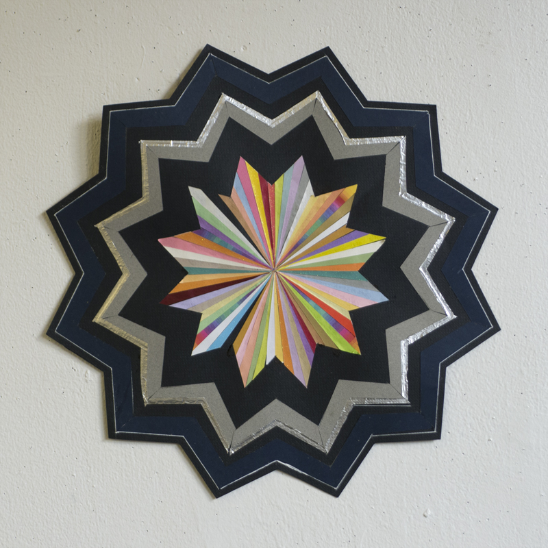
The color stripe composition, like a color grid, presents students with the challenge of exploring specific color contrasts. In this assignment, I asked students to explore what Itten called contrast of extension—also referred to as contrast of proportion. This form of color contrast is based on the concept of light values, originally proposed by the 19th century German polymath Johann Wolfgang von Goethe.
Goethe devised a system of color harmony for primary and second colors, in which each color is assigned a numerical value based on its brilliance. Yellow, the color closest to white in brilliance, is assigned the highest light value; violet, the farthest from white in brillance, is the lowest. Red and green are equal in brillance, and equally distant from yellow and violet. Blue is closer in brillance to violet than green, and is assigned a value midway between those colors. Similarly, the brillance of orange is midway between yellow and red.
The numeral light values: yellow = 9, orange = 8, red = 6, violet = 3, blue = 4, green = 6.
In these projects, students used the principle of light values, along with personal color associations, to express concepts related to war and peace. They explored the idea of a stripe composition as a kind of abstract expression—the rhythmic intervals, proportional relationships, and suggestive characteristics of simple parallel forms. The visual structure of a diptych is employed to express the contrasts and connections of war and peace.
In this last example, the designer abandoned the traditional diptych structure and challenges our definition of stripes, to achieve a powerful expression of war and peace.


