
Color Exploration for Morgan Stanley
In 2023 I was commissioned by Morgan Stanley to explore ways of updating the company’s existing color palette. The goals of this theoretical exploration: 1) expand the company’s existing color system while maintaining its essence; 2) create a standard set of color pairings to help unify the ways colors are combined; and 3) ensure ADA compliance in the use of color throughout the company’s visual communication products. The results of the exploration, shown here, were intended to help Morgan Stanley’s design team in the evolution and ongoing development of the company’s visual brand guidelines.


ColorChords
In The Art of Color, Johannes Itten professed a belief in the relationship between the twelve musical notes and the twelve colors of his color wheel. Like the twelve musical notes, the twelve colors are arranged in steps. Each note is a defined by the surrounding notes; each color is defined by its adjacent colors. Musical notes can be combined to form sonically harmonic chords; colors can be combined to form visually harmonic chords.
ColorChords is an ongoing personal project—a way for me to express my love of guitars and graphic design. Shown here are prototypes for a series of designs based on familiar musical chord progressions.
Goethe wrote that red “conveys an impression of gravity and dignity, and at the same time grace and attractiveness.” With that in mind, in these initial designs I assigned a red background to the C ColorChord. The colors of the background and finger dots for the C design are expressed in split-complements—red is the base color, and yellow-green and blue-green define the finger dots. The base colors for the C, F and G ColorChords use the same split-complements: red, yellow-green, and blue-green. As in the C ColorChord, the finger dots in the F and G designs are also split-complements: the base of the F ColorChord is yellow-green, with red-orange and red-violet finger dots; the base of the G ColorChord is blue-green, with finger dots in orange and red.
Above: C, F and G ColorChords; below, designs applied in poster form.

The ColorChord cards for tenor guitar (below) are a fun way learn chords and chord progressions, and simultaneously play with colors.
I use these cards to map out chord progressions—this experimental process often results in surprising results. The ColorChord cards for tenor guitar were originally commissioned by Moo and published on the blog QuartoKnows.

Chelsea CSA logo
Chelsea CSA (Community Supported Agriculture) is a volunteer-run organization that helps sustain New York State family farming, by distributing organic seasonal produce to the residents of New York City’s Chelsea neighborhood, every week from June through November. As a volunteer, I donated the design and use of this logo. And with my partner Alicia, who manages distribution and communications for the group, I am applying the logo to the website, social media, tote bags, water bottles and wearables.
Development of the Milken Institute logo
During 2017-2019 I worked in partnership with the Piderit + Partners agency on the new visual identity system for Milken Institute. The overall challenge was to create a mark that would function well as a Twitter avatar, along with the usual assortment of logo applications. I served as principle designer, responsible for design and execution. Here is a chronological display showing the finished logo on top in solid and outline forms, followed by a grid showing a selection of digital renderings that led up to the final design. Note the range of designs that emphasized the MI initials—these designs were initially used in all applications, and have now been replaced by the simpler versions without initials.


To see this displayed in animated form, click here!
Applications of the Milken Institute logo
Photos from Milken Institute Summits showing the logo and wordmarks displayed on stage backgrounds.


Logo animation by Edmund Lee
Stavros Niarchos Foundation
I was introduced to the Niarchos Foundation in 1999 by Hildy Simmons, a managing director at JPMorgan. Over the next eight years I worked with Hildy on a series of printed reports, describing the Foundation and listing the grantees. Stavros Niarchos, the namesake of the Foundation, was a Greek patriot—the images we used in the reports are expressions of his love for his country.
My favorite images are arranged below—abstract compositions of lines and shapes, ancient Greek designs, inscribed into stone panels. These digital compositions were made from photographs I shot in early 2007 in the Greek galleries of the Metropolitan Museum of Art. For me, these ancient designs are expressions of the timeless design principles that guide my work.


Below: spreads from the 2007 Niarchos Foundation Report


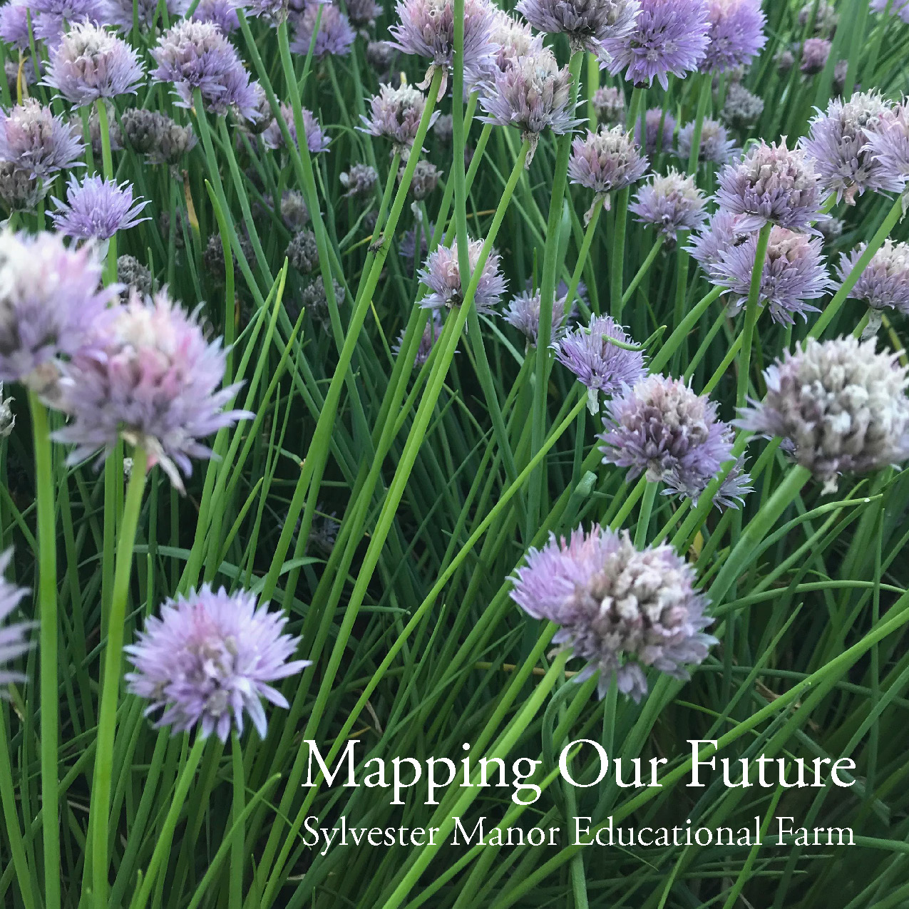
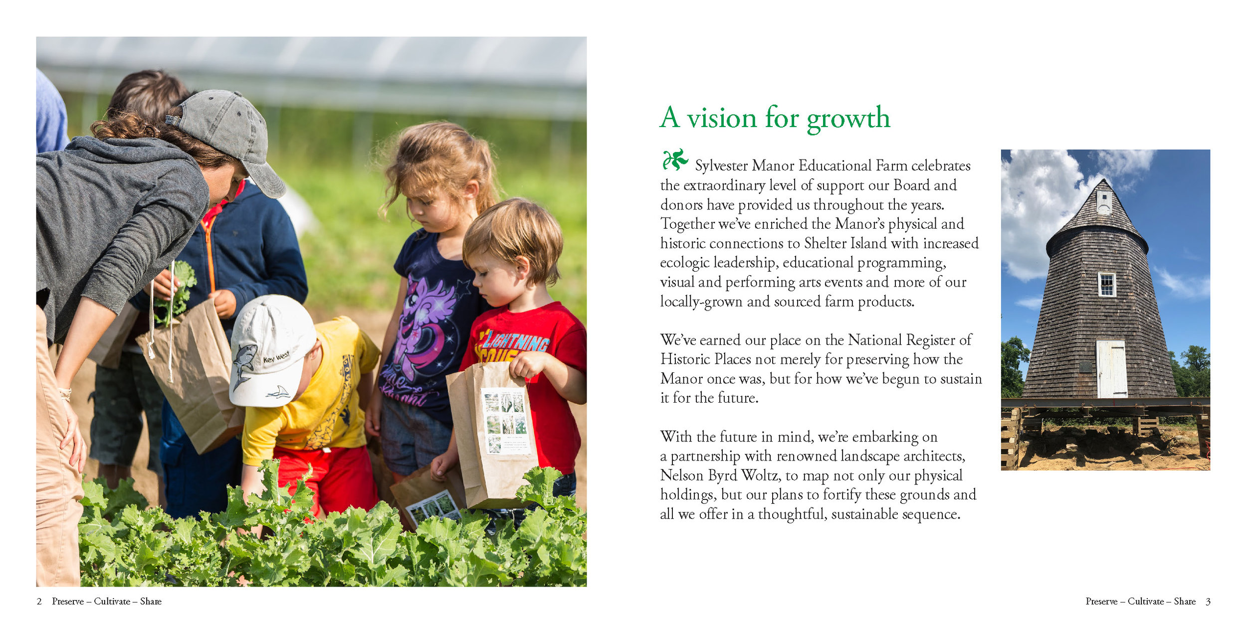
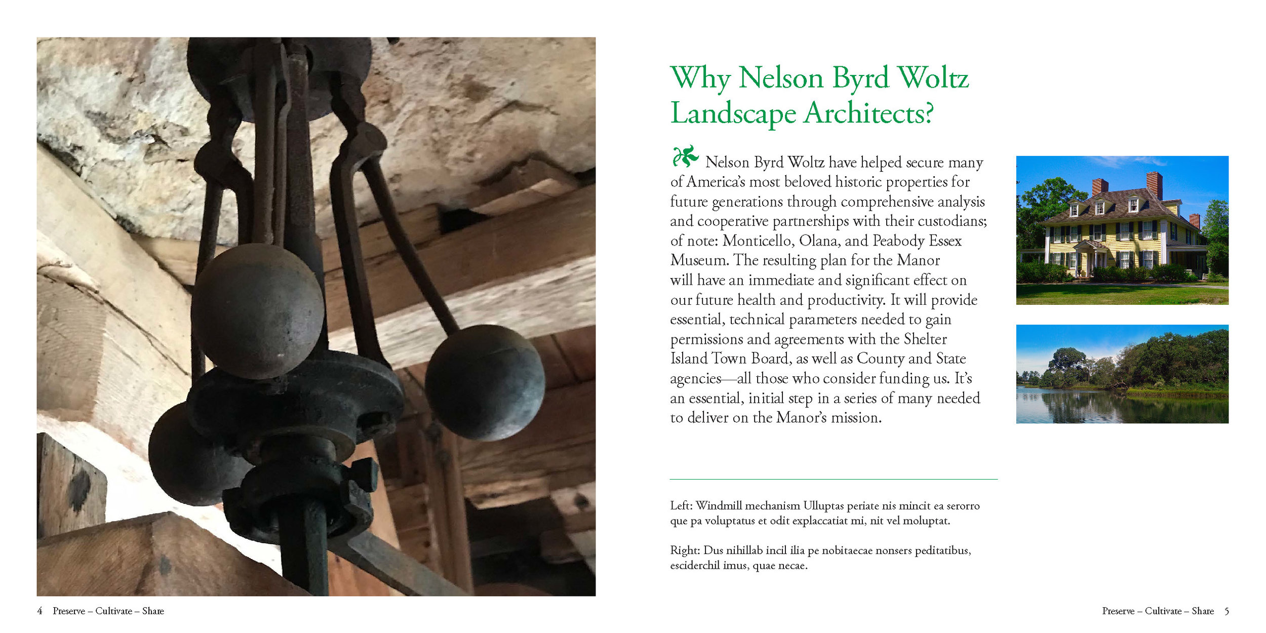
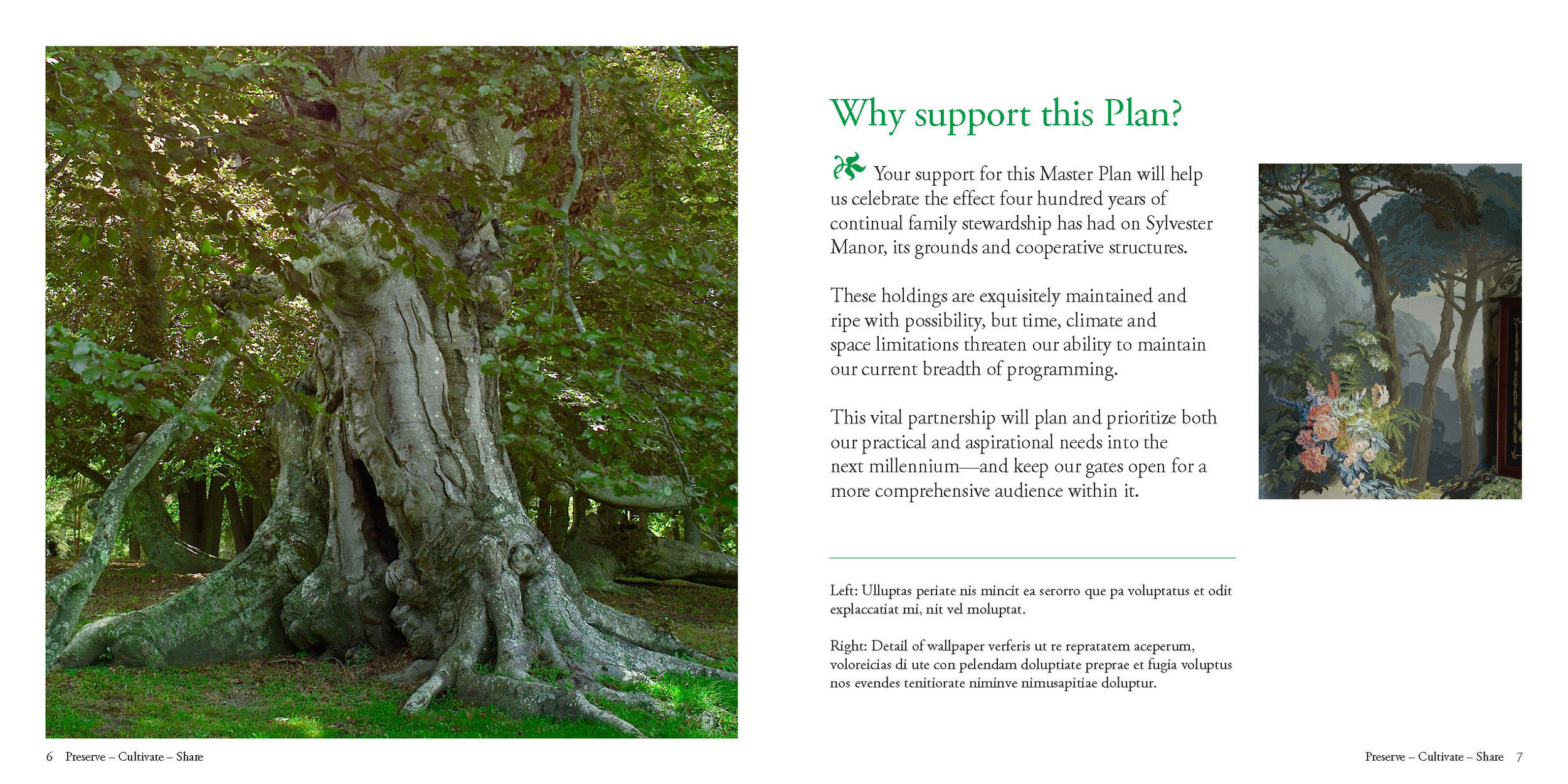
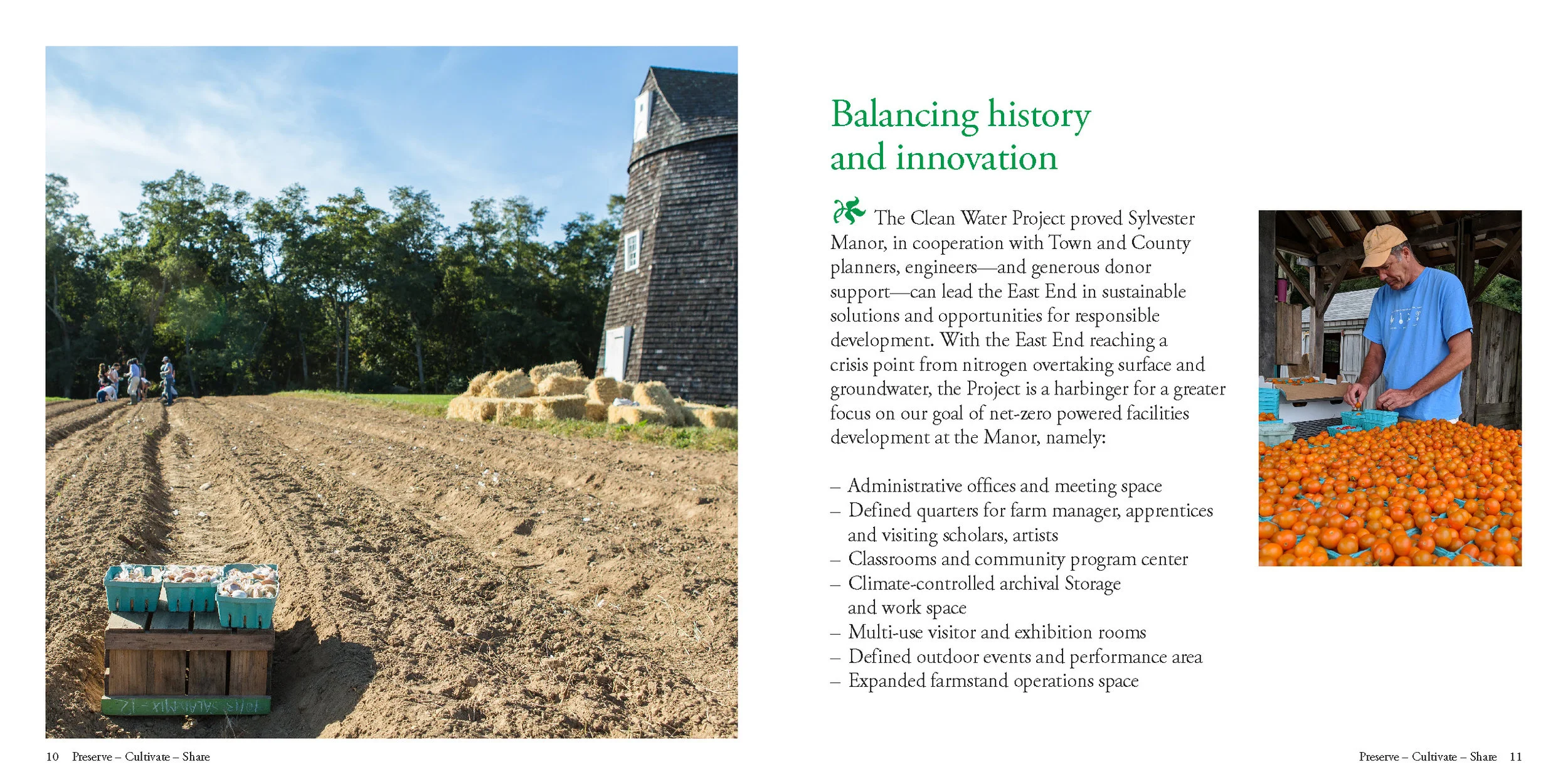
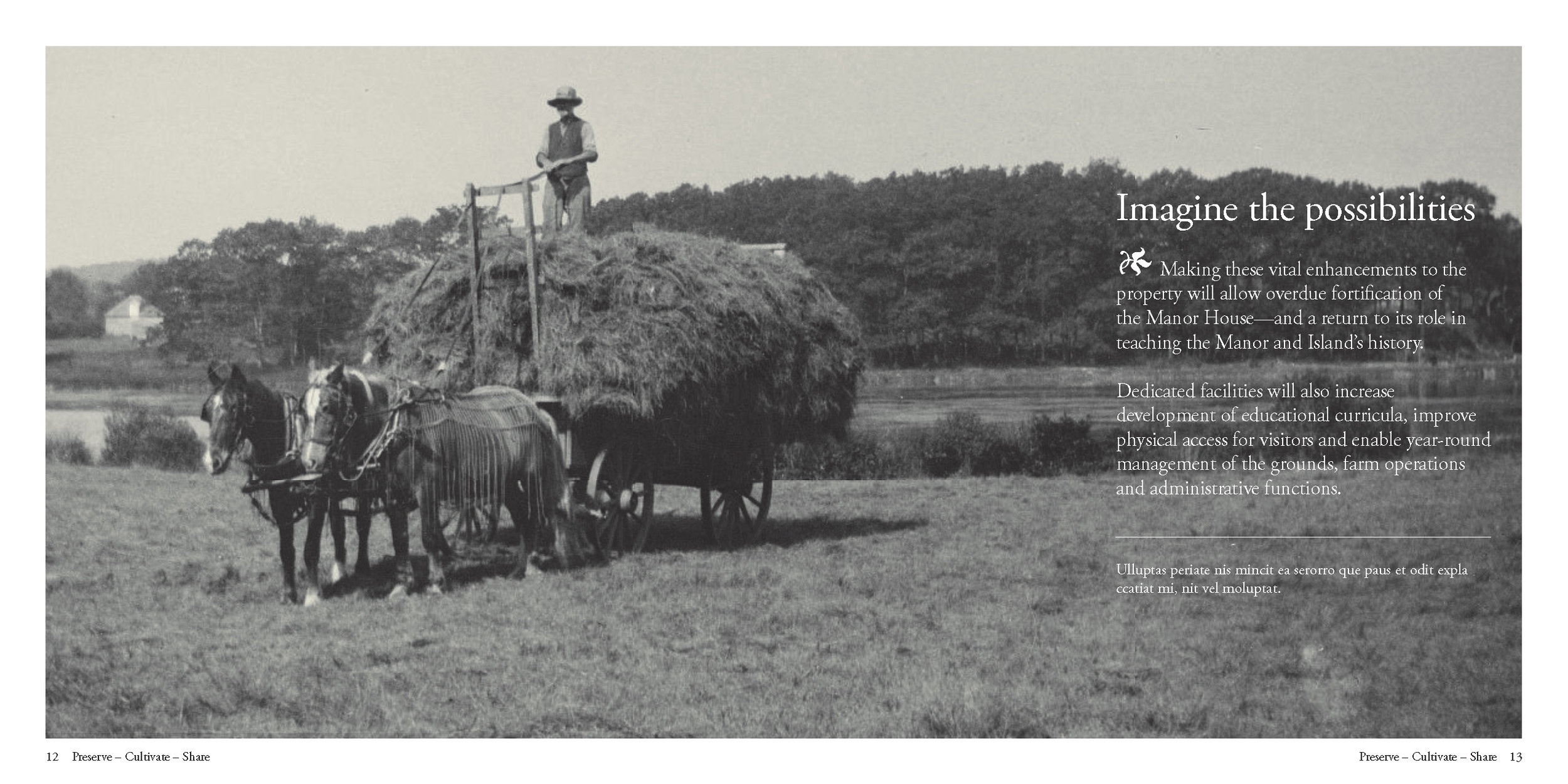
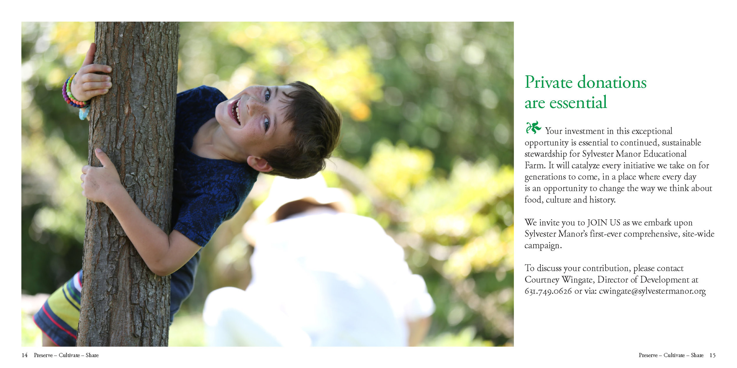
Sylvester Manor Educational Farm
Design for a fundraising brochure for Sylvester Manor Educational Farm, using photos from their archive.
Concept development & writing by Alicia Mehl, under direction of Courtney Wingate, Director of Development at Sylvester Manor.

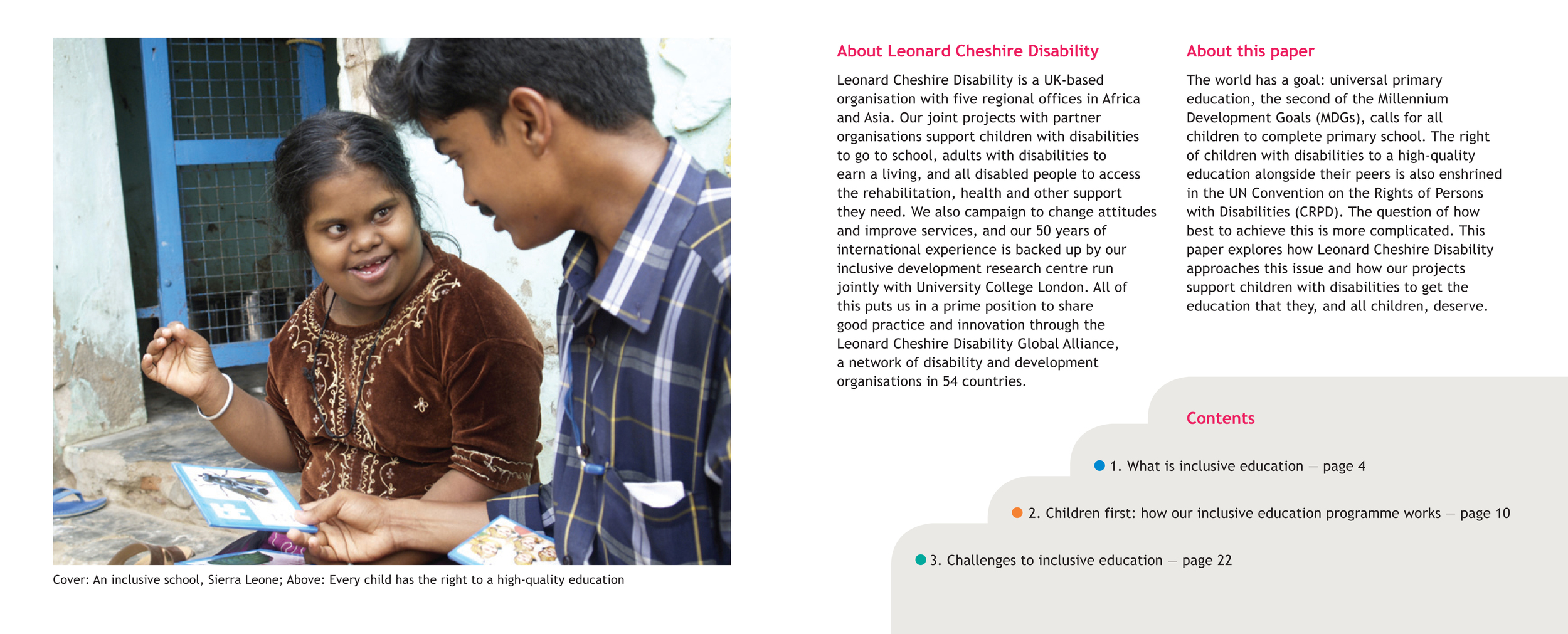
Leonard Cheshire Disability
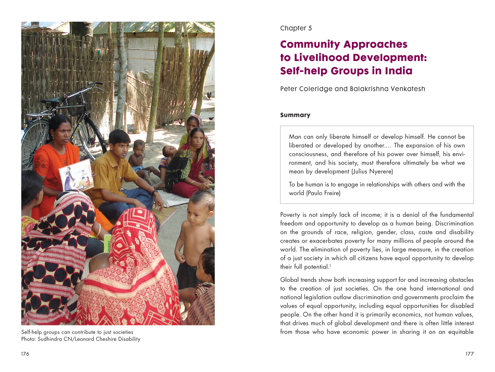
Leonard Cheshire Disability is a UK-based organisation with five regional offices in Africa and Asia. Their joint projects with partner organisations support children with disabilities to go to school, adults with disabilities to earn a living, and all disabled people to access the rehabilitation, health and other support they need.
Here is sampling of the projects I have completed for Leonard Cheshire Disability, designed to be used by people with vision impairment.


Playing with Color
Playing with Color is a workbook of color experiments for professional graphic designers, students of art and design, self-taught designers… anyone interested in color! It presents an accessible and playful approach to the serious study of color, and an exploration of the energy that color brings to design. Readers are encouraged to adopt a disciplined yet playful approach to visual problem solving. Each project provides color experience; each experience adds substance to the reader's color awareness. The book begins with thoughts on the philosophy of learning and the process of play. The experiments begin with the classic color exercises of Itten and Albers, followed by a series of original color design projects. Each experiment is expressed in a compelling display of words and images, designed to inspire and inform your embrace of color, form, material, and craft.


