Principles of Visual Language: Form + Color

These projects were recently created in my online class Principles of Visual Language: Form + Color. They represent the ten assignments from the class, arranged from last to first.

Many thanks to my students—Luana Pompiani, Amanda Johnston-Fisher, Jennie Eberwein-Agert, Allison Erdman, David Johnson, Kentaro Oi, Shannon Palmer, Rosalyn Somsak, and Melissa Major for their good work!

Visual Language: recent work

These grayscale collages were created in September by Visual Language students. The assignment objective is to explore geometric shapes—rectangles, triangles, circles—and freeform/organic shapes, in combination with contrasting areas of light and dark, and varieties of visual texture. This assignment encourages an awareness of the compositional principles of visual hierarchy and figure/ground. 

Visual Language: recent work

The following color compositions, expressions of complementary and split-complementary contrasts, were created by current first-year students in my Principles of Visual Language classes. Students explore a variety of complementary and split-complementary colors, first with gouache paint, then with Color-aid paper, and finally with found materials.

Color compositions by Bernice Sheung Cho Wong, Jade Babolcsay, Jennifer James, 
Misha Hunt, Tara Delucci, Kimberly Wu, Patrick House, Yifan Yang, Stefan Krsmanovic, 

Annie Smith, Theo Guillin, Minchai Lee and Eun Seok Park.

color illusion

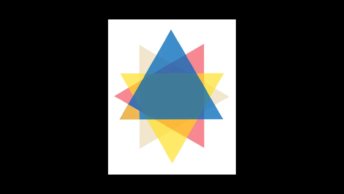
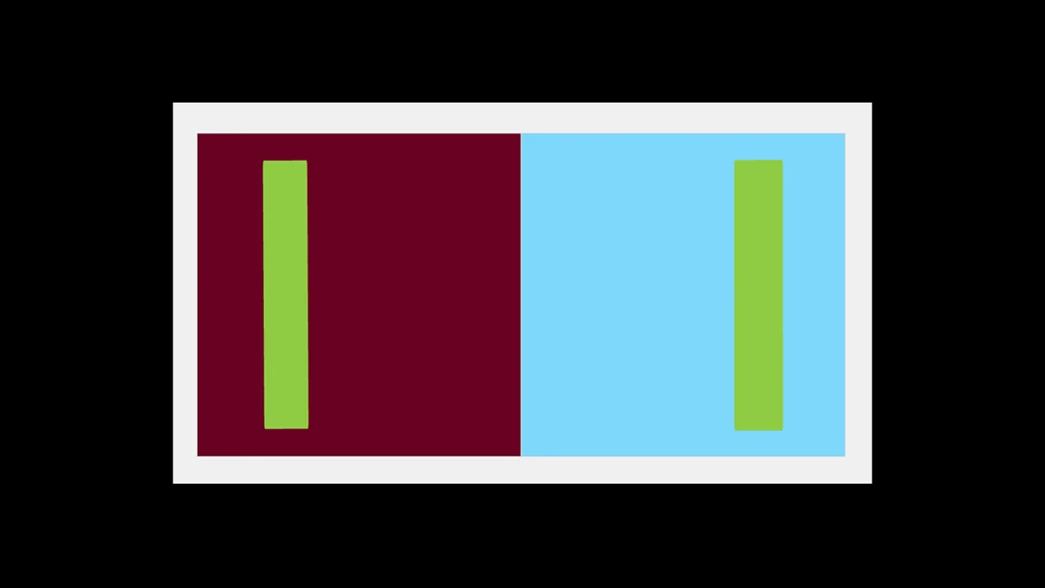
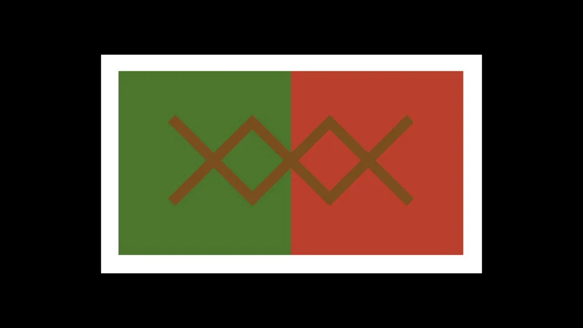
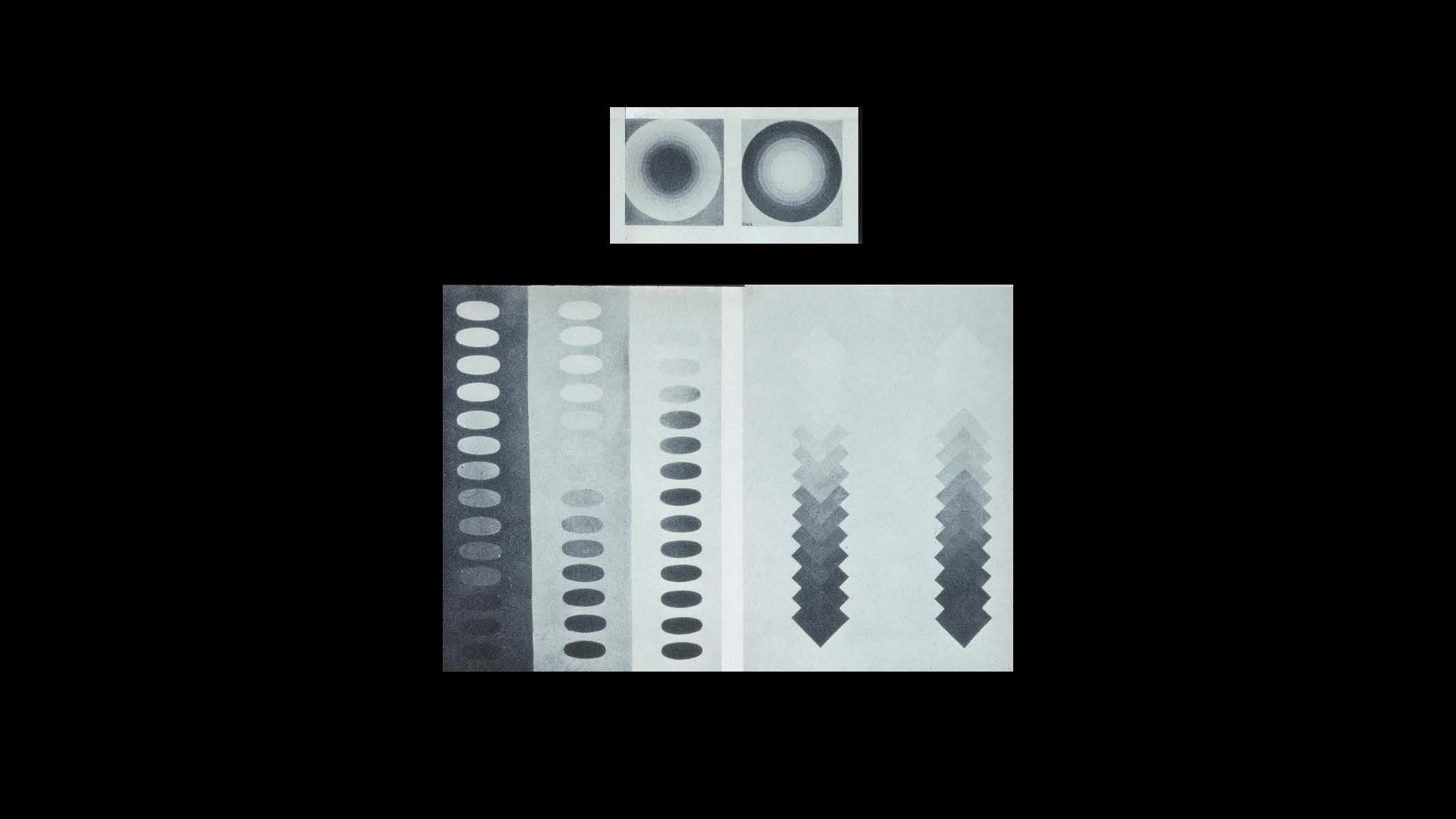
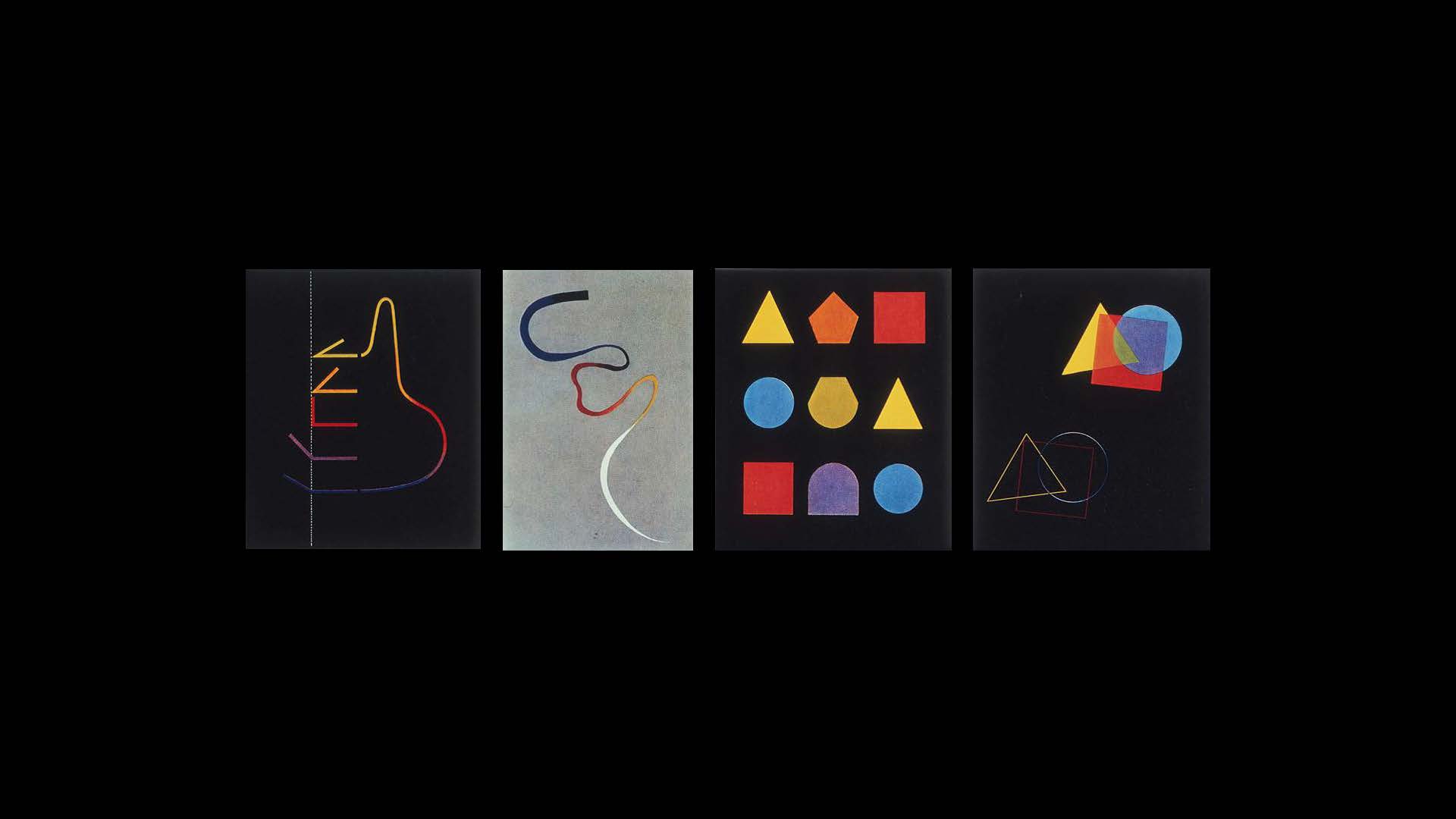
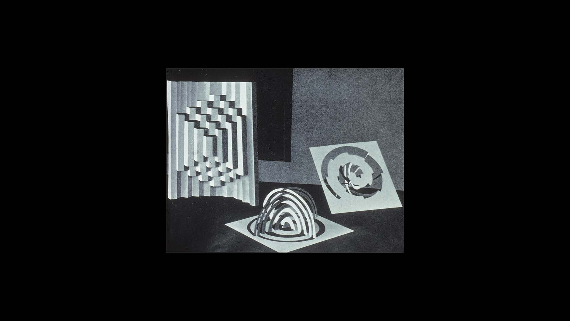
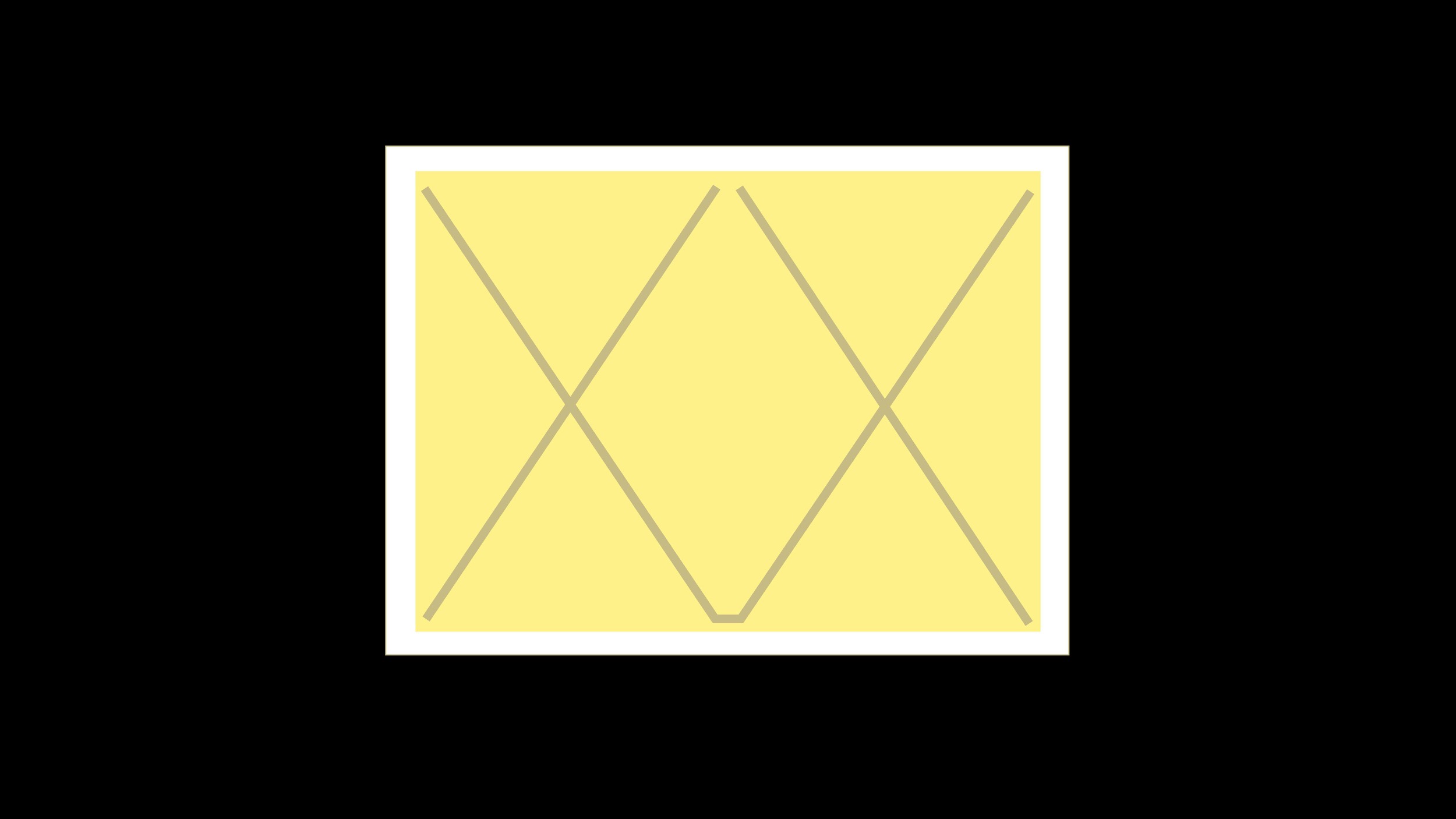
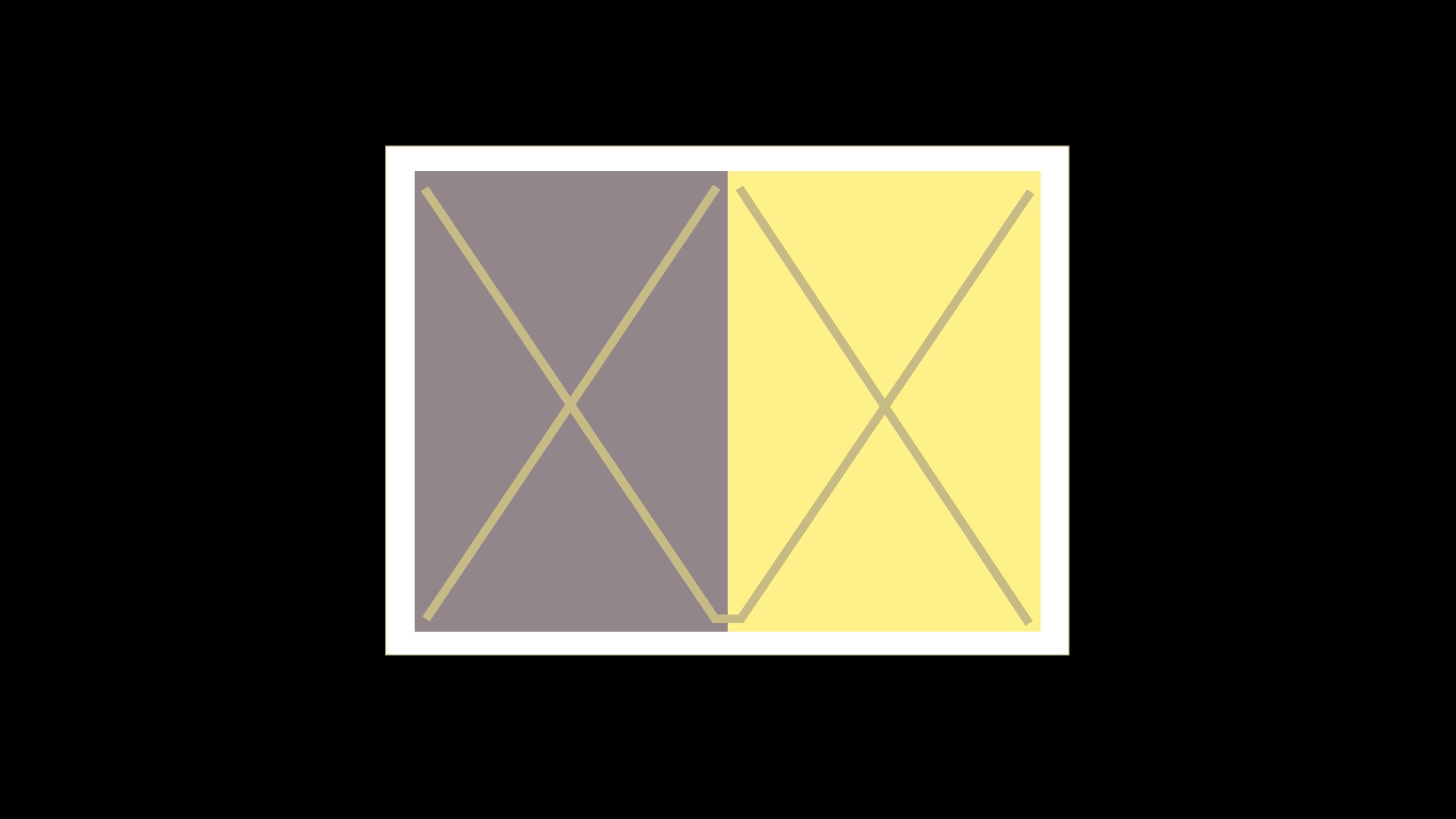
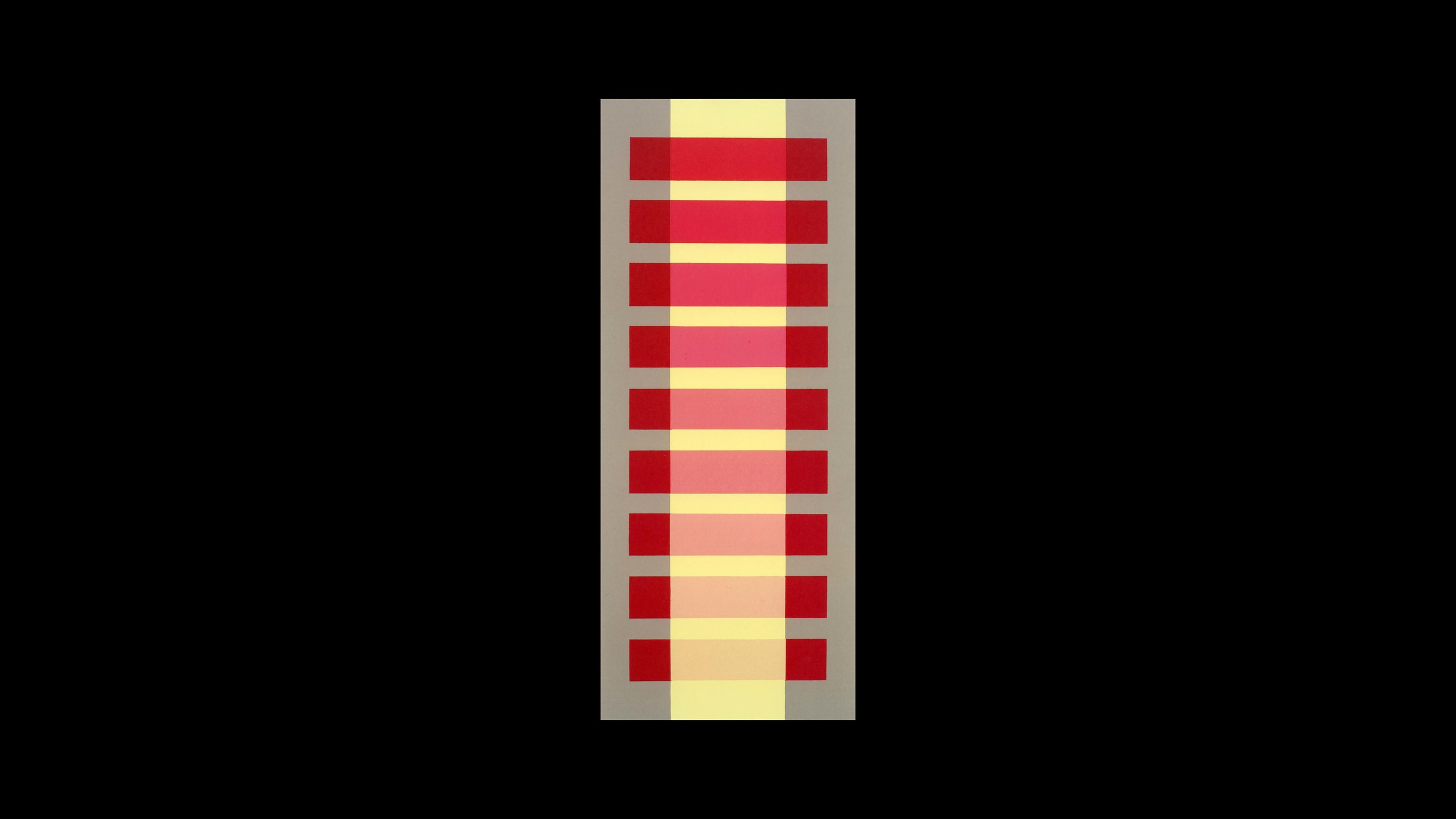
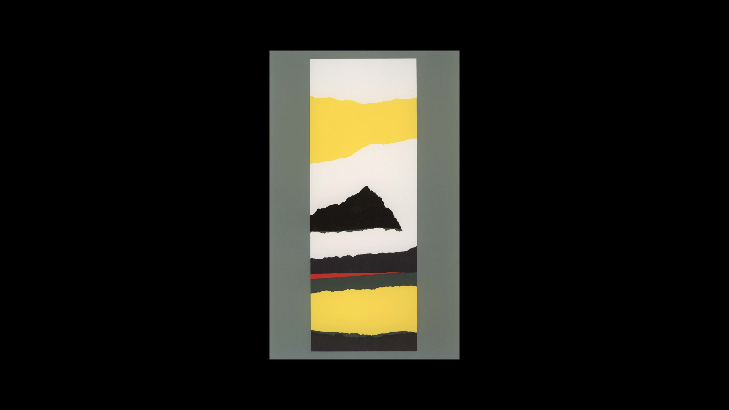
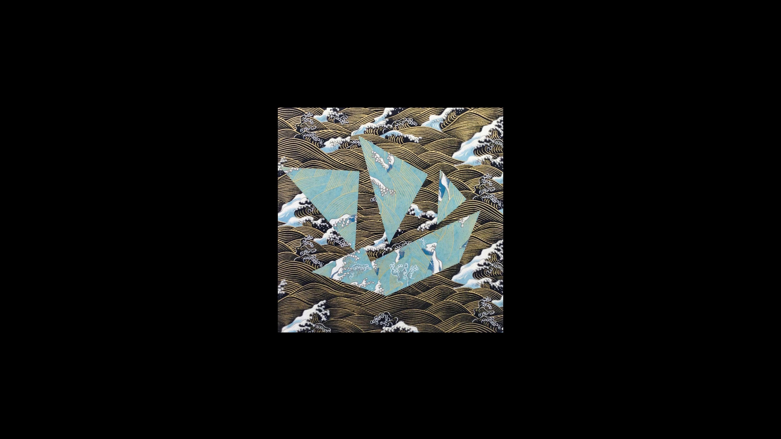
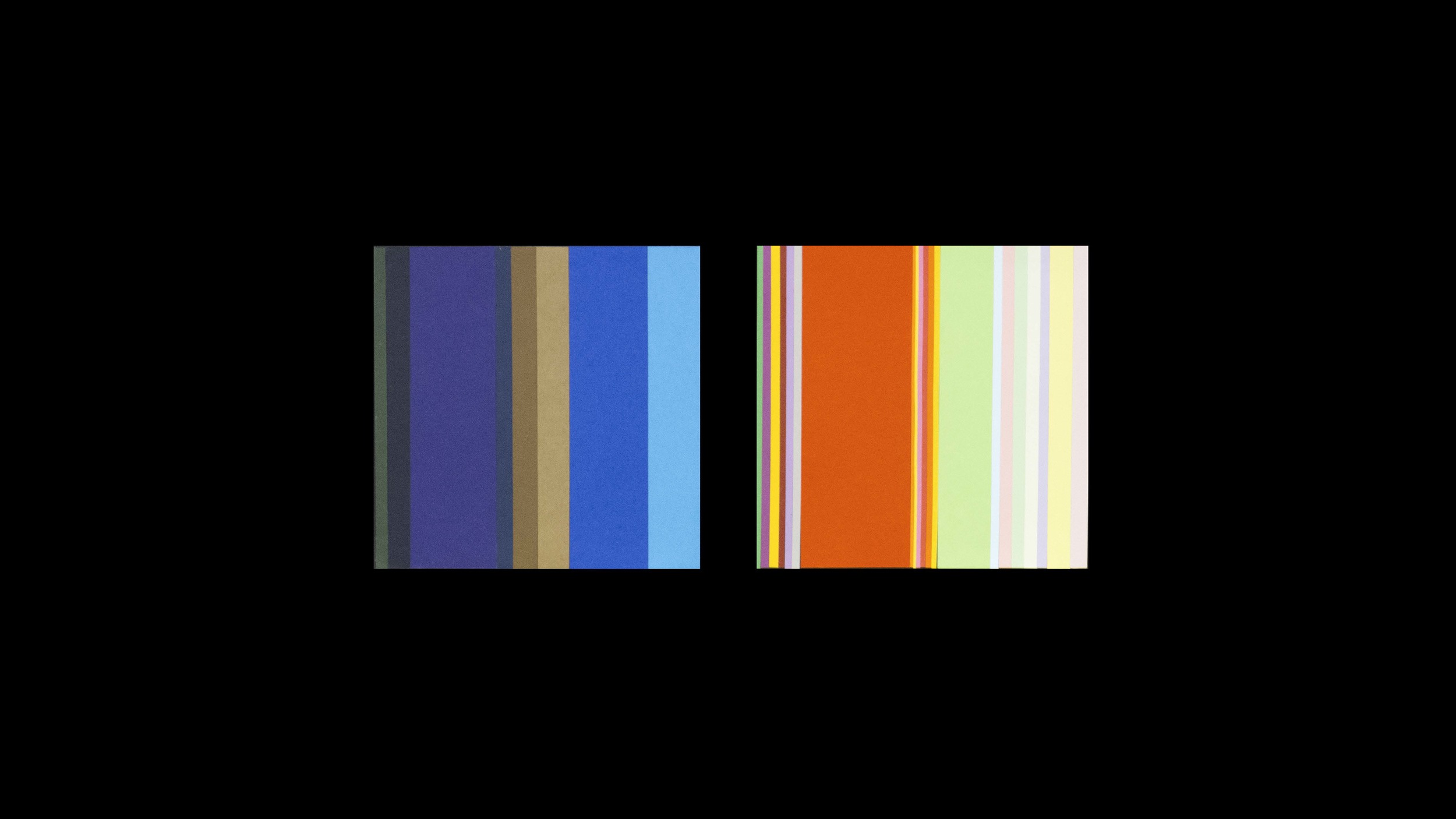
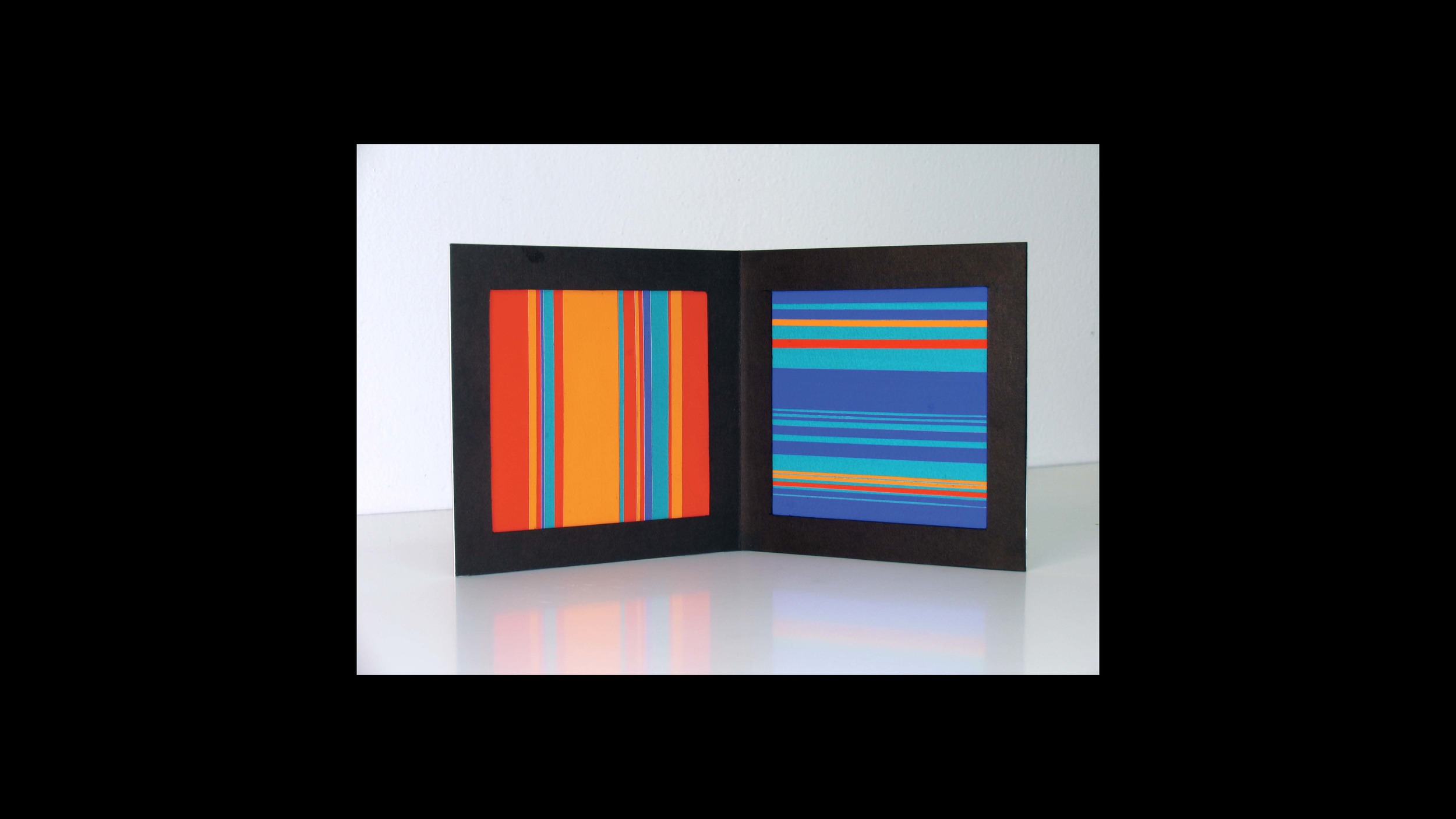
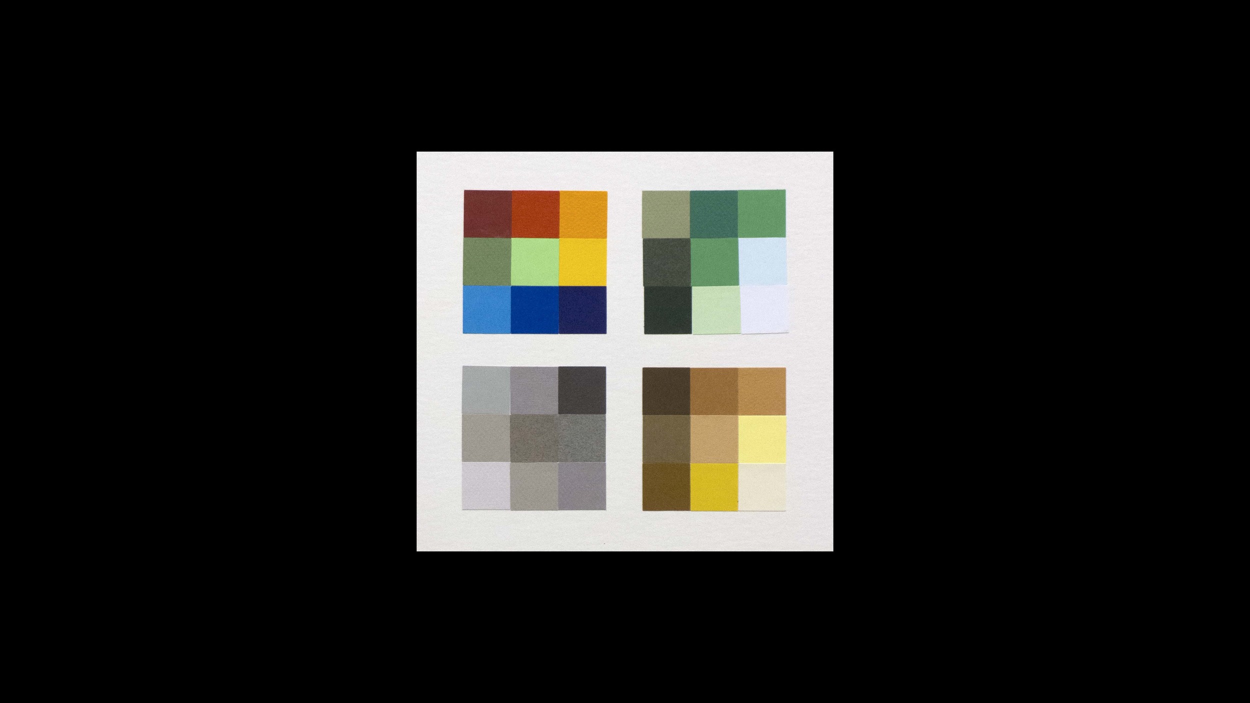
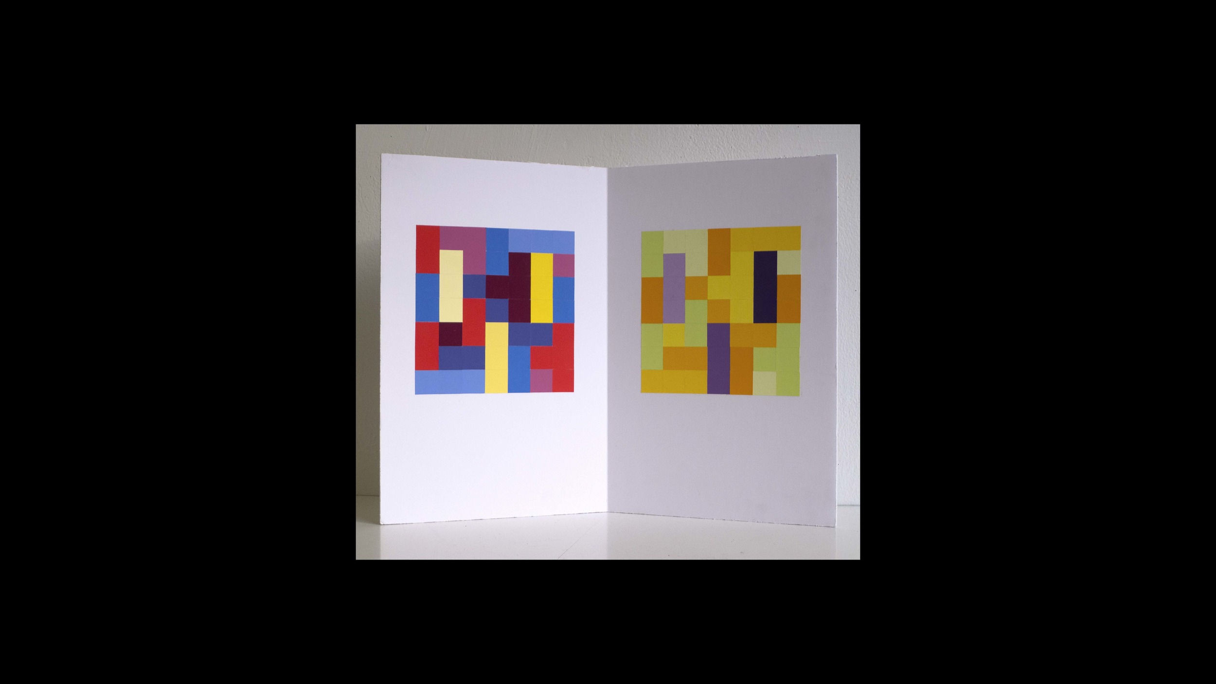
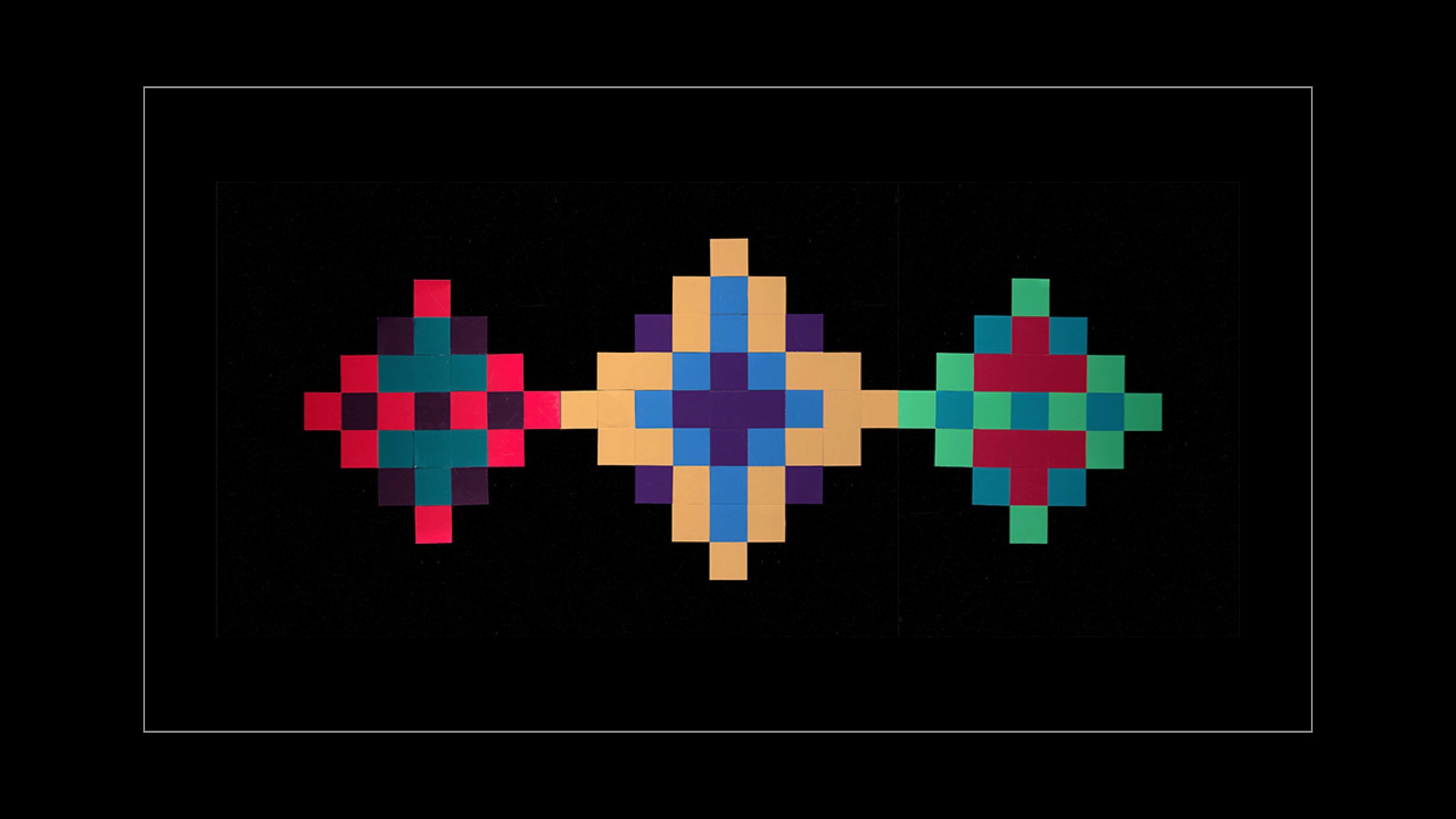
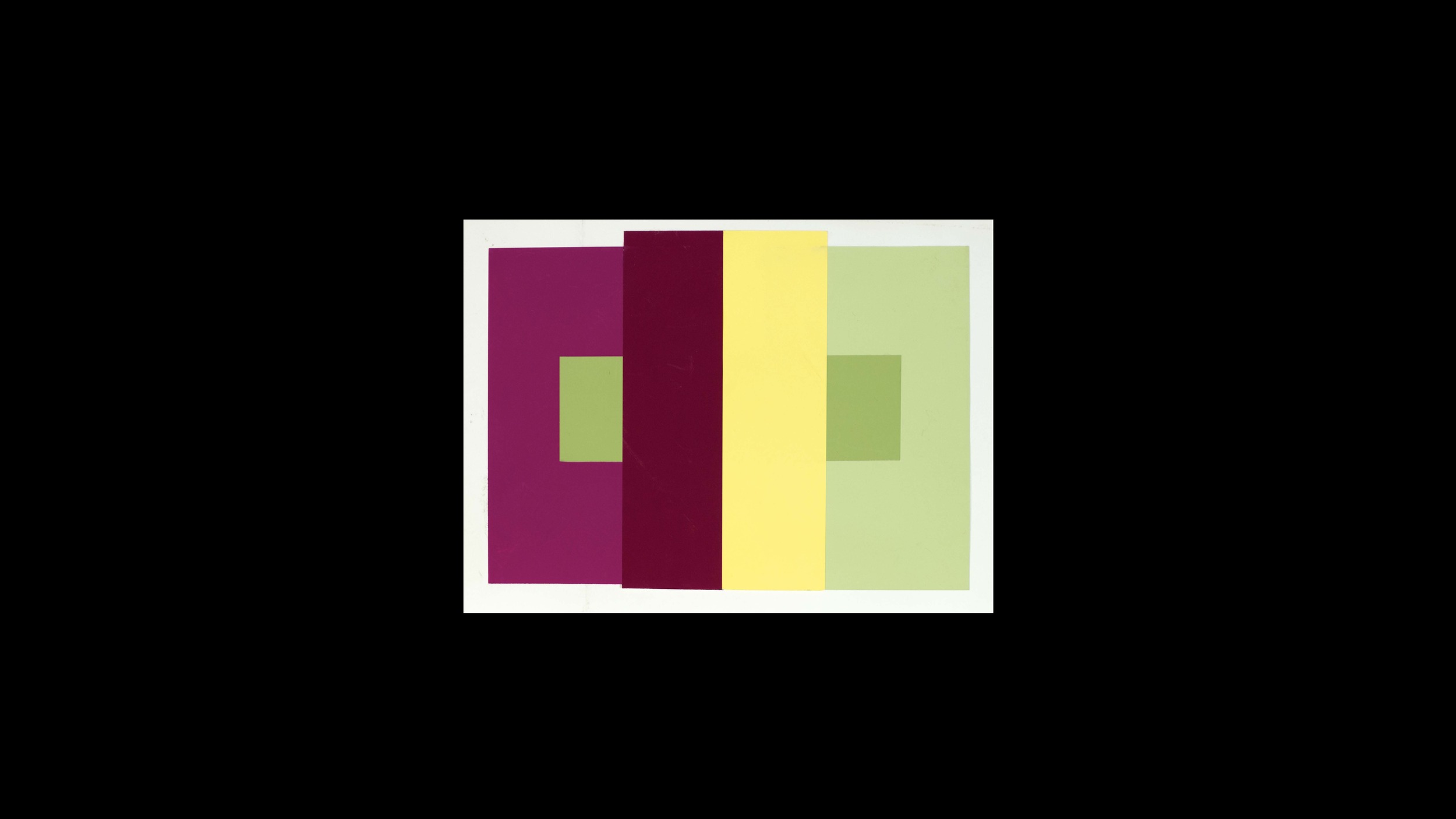
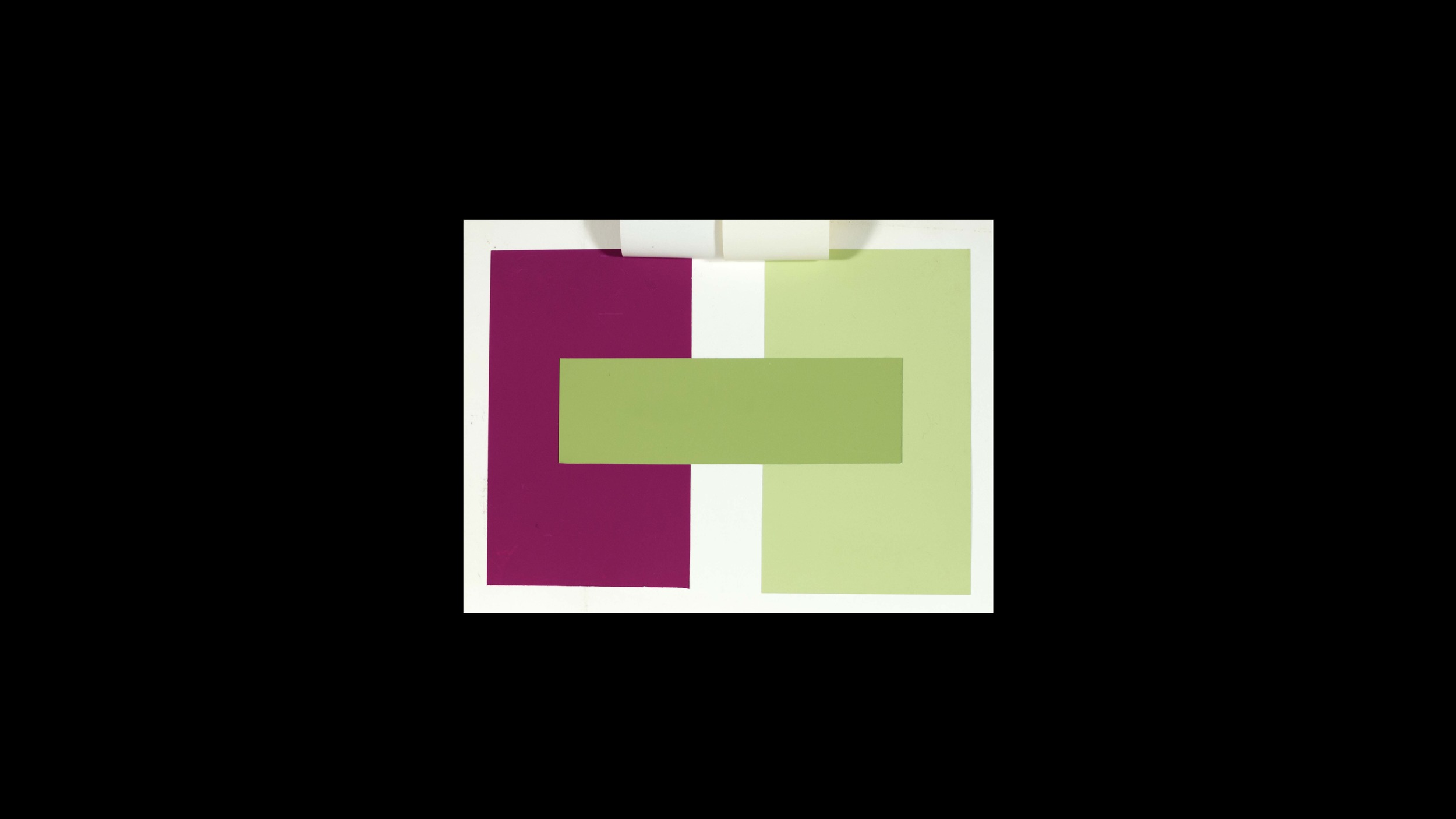
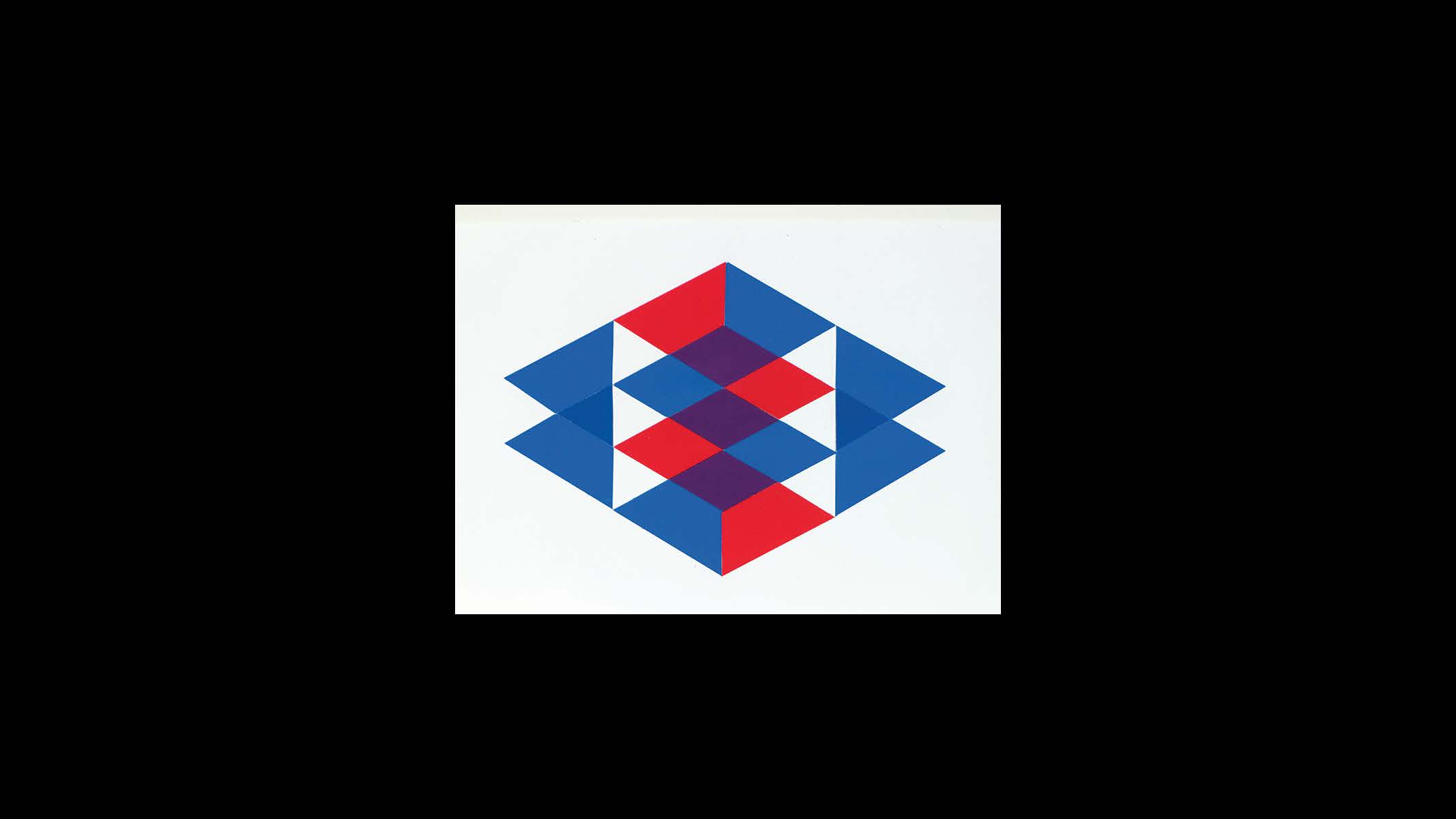
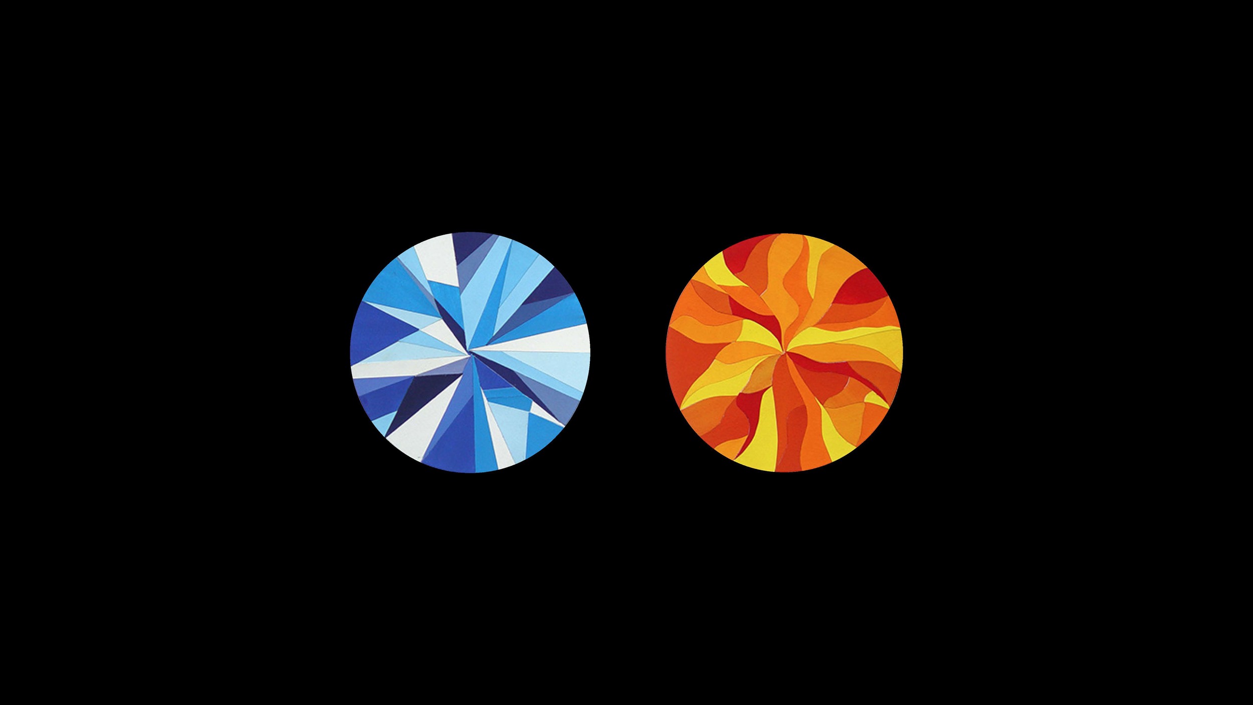
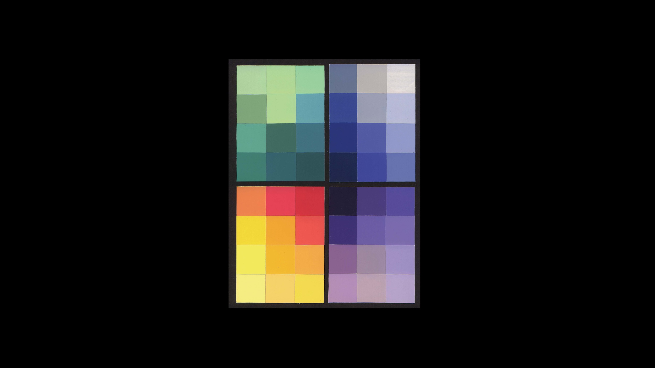
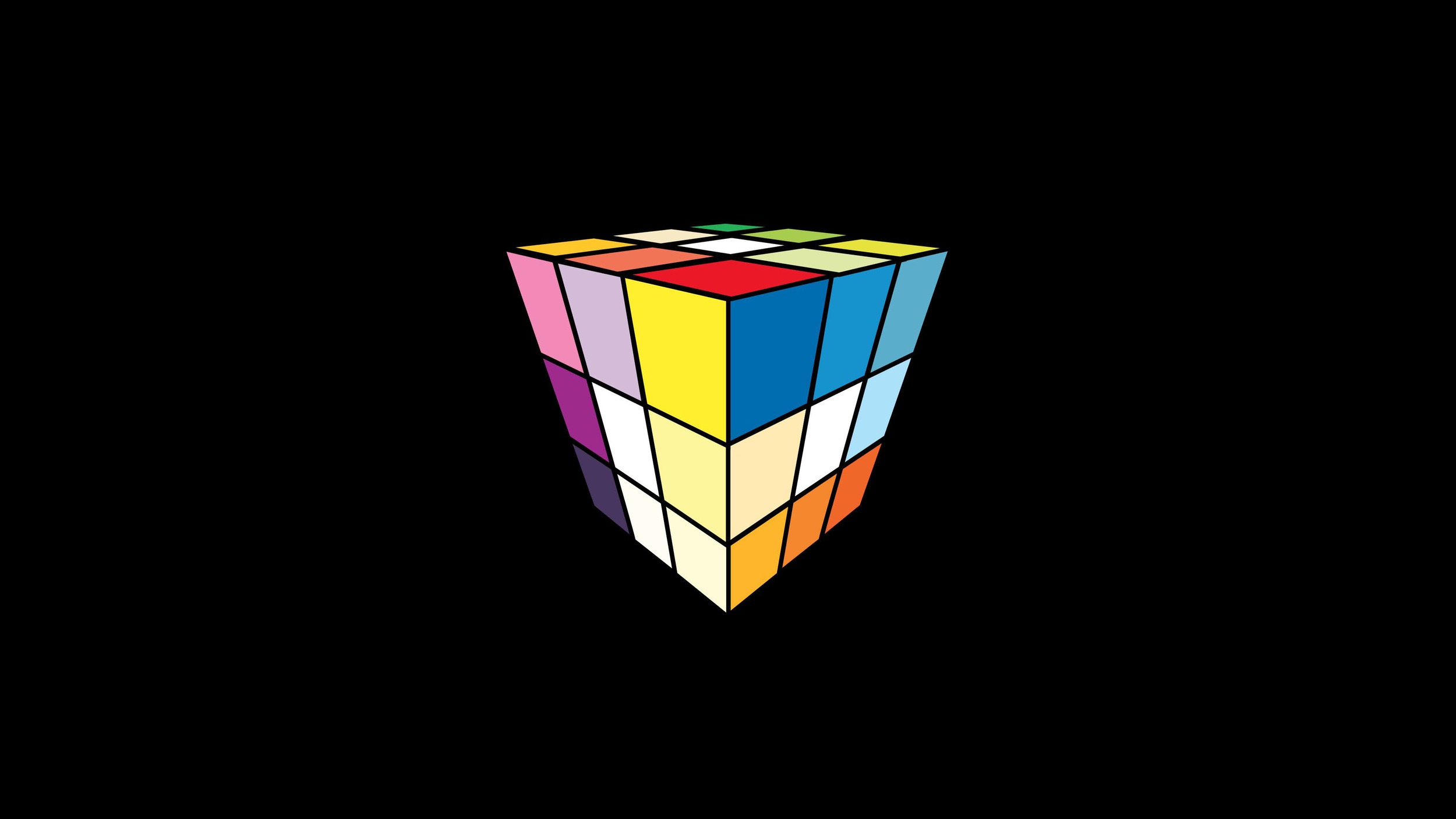
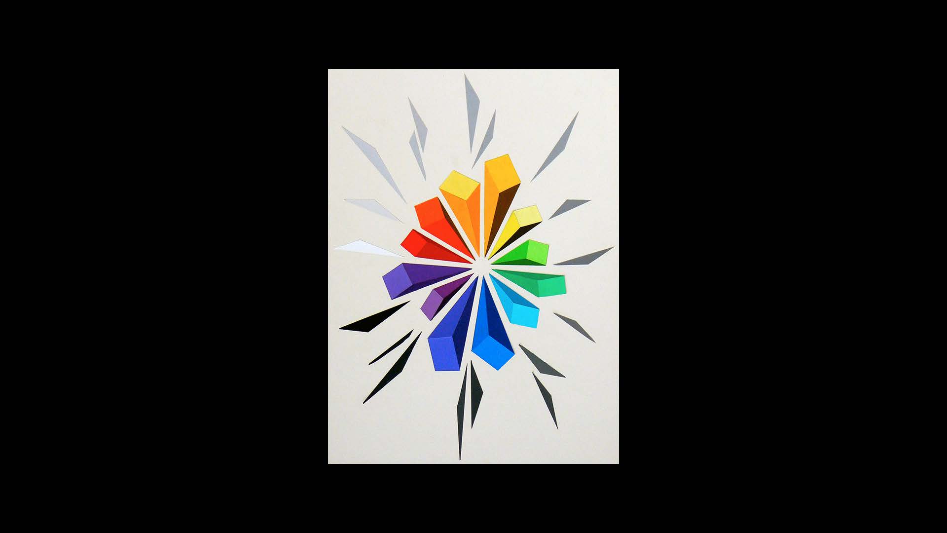
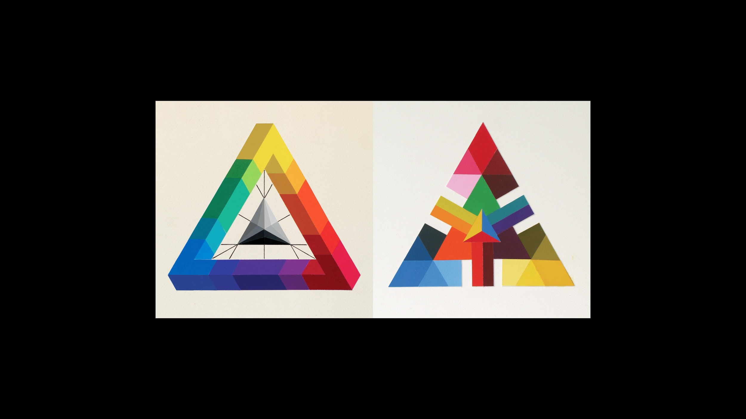
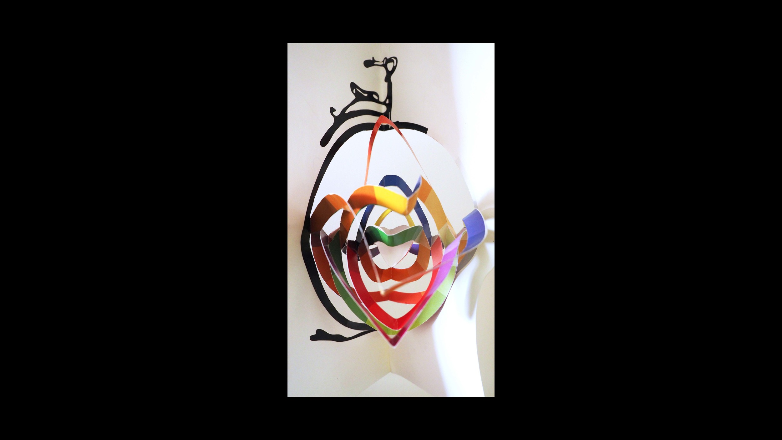
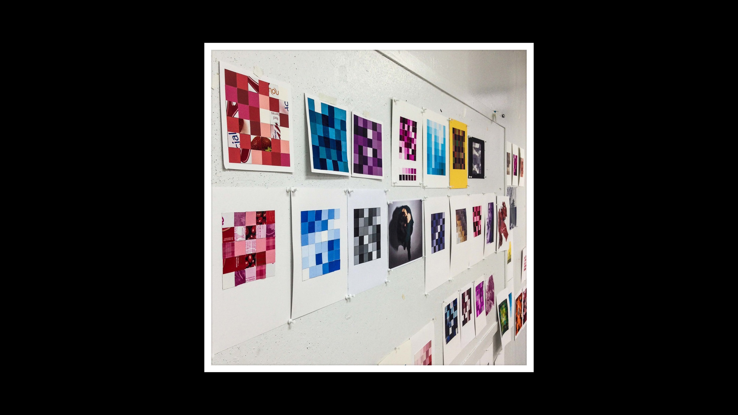
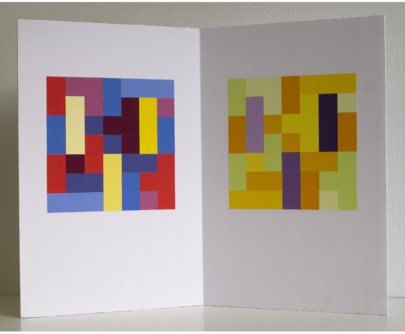
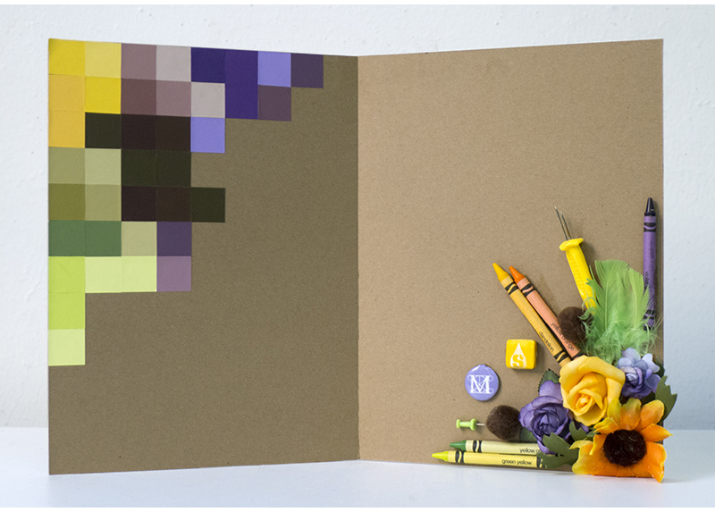
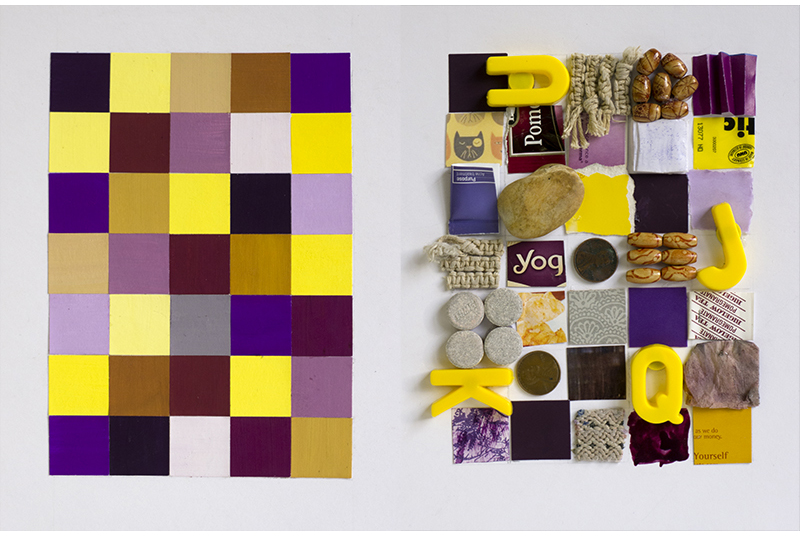
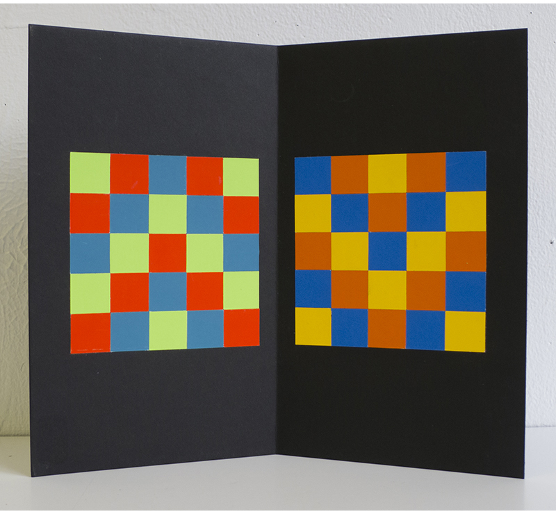
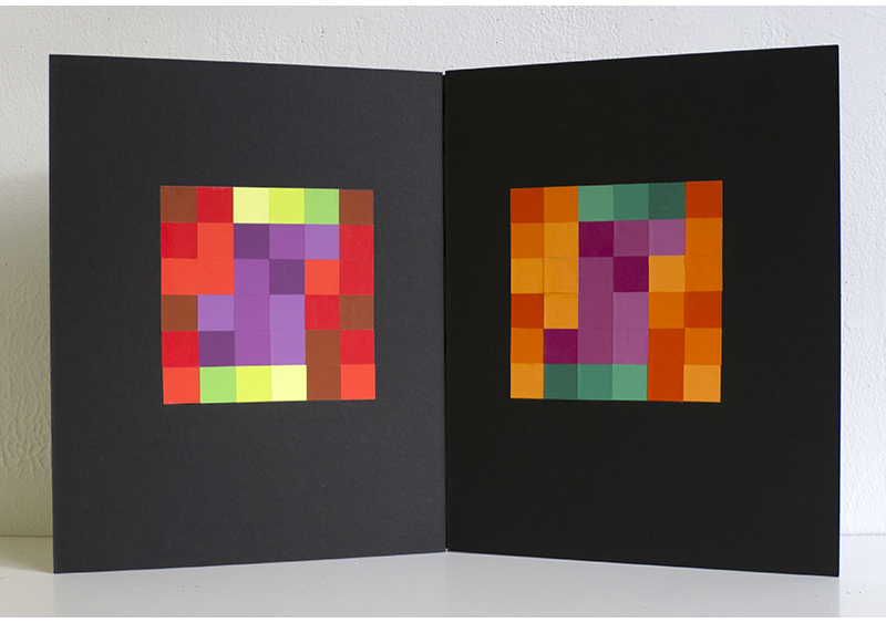
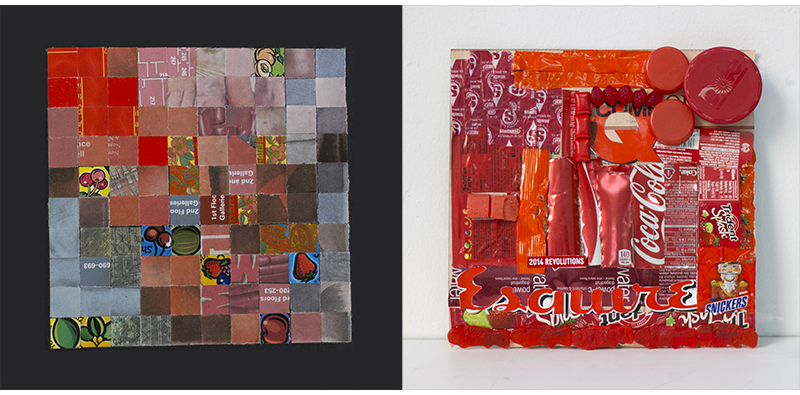
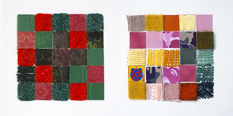
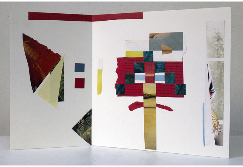
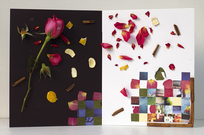
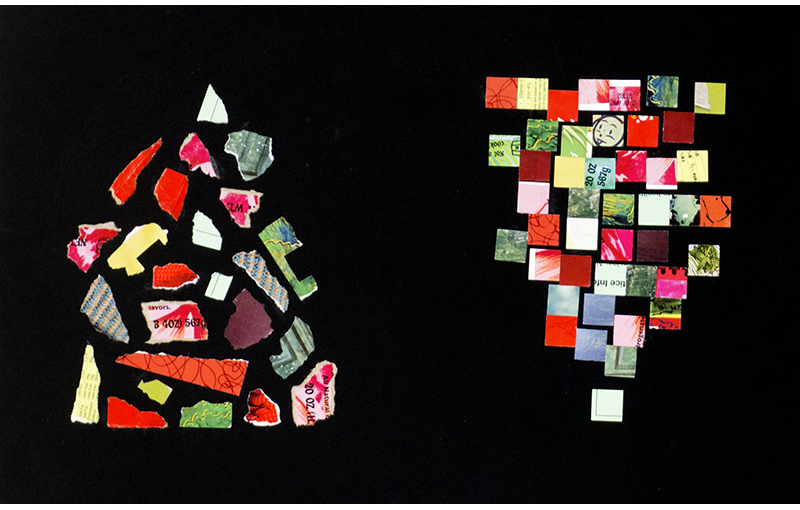
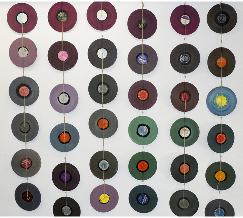
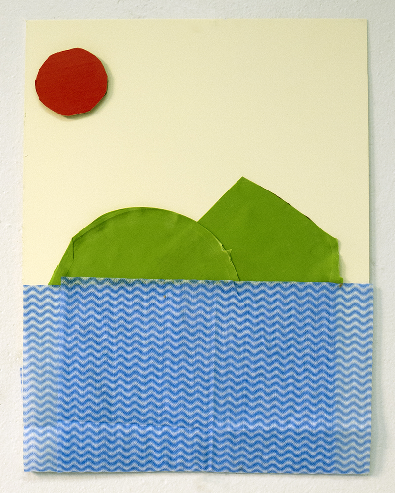
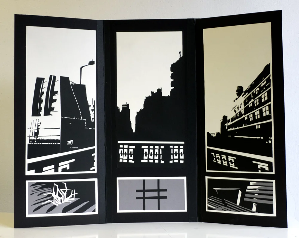
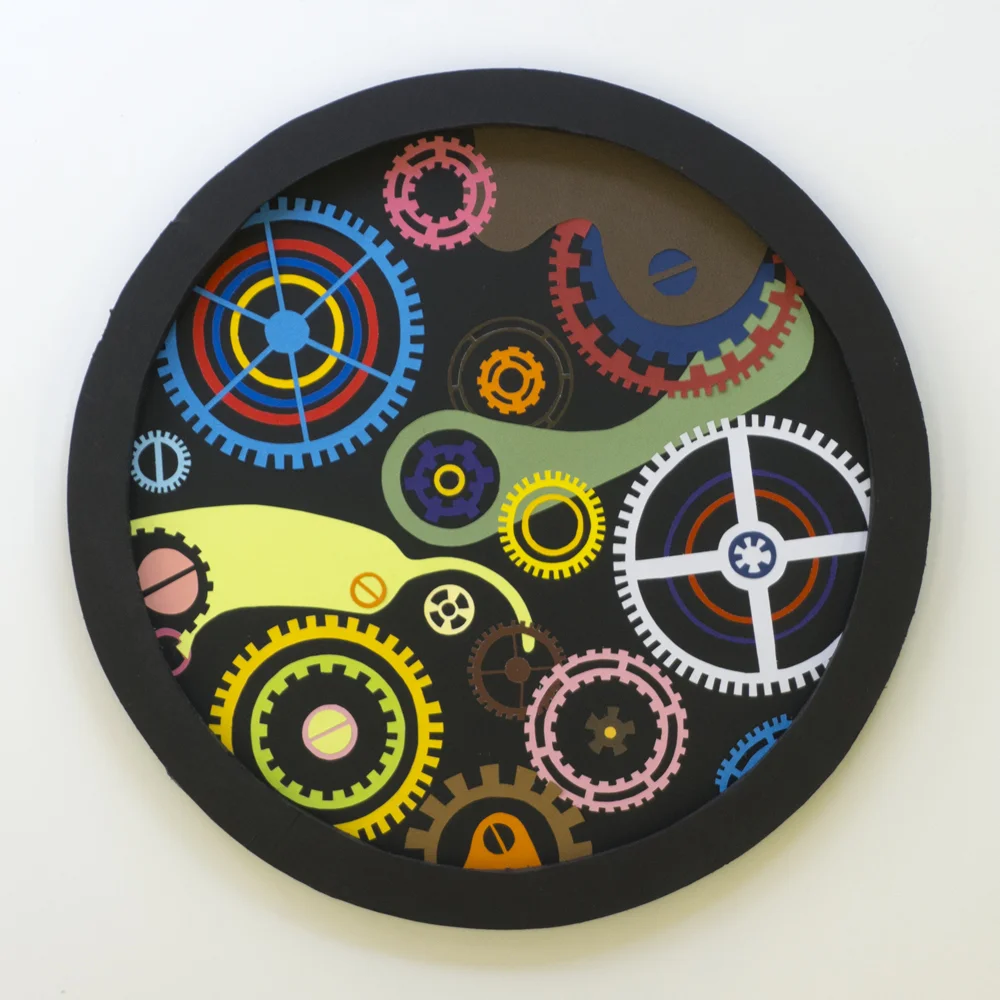
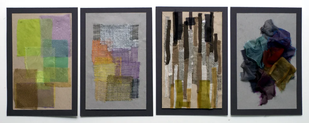
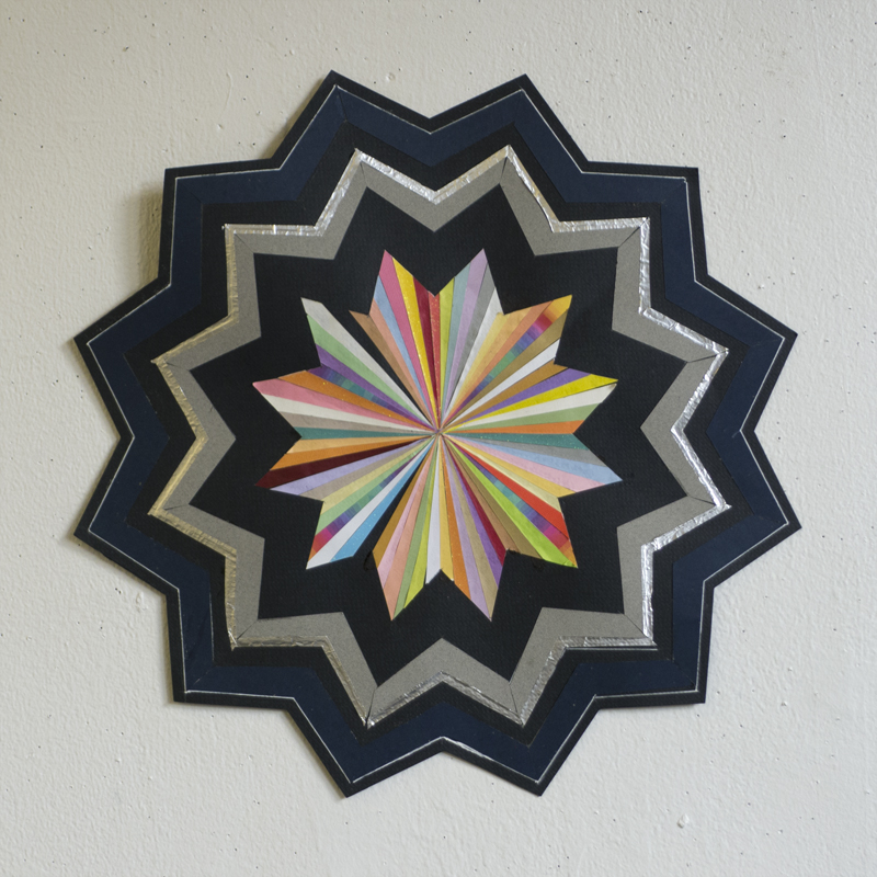
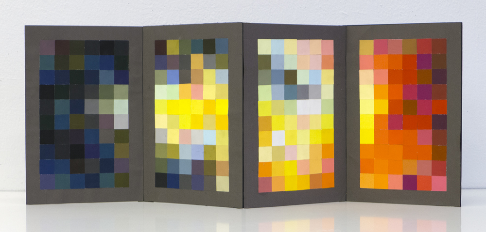
These color projects, recently created by my Visual Language students, are based on color experiments originally taught by the painter, designer, writer and teacher, and my hero, Josef Albers http://www.moma.org/collection/artist.php?artist_id=97

The color illusion assignments that Albers gave us have become icons of the art school experience: 

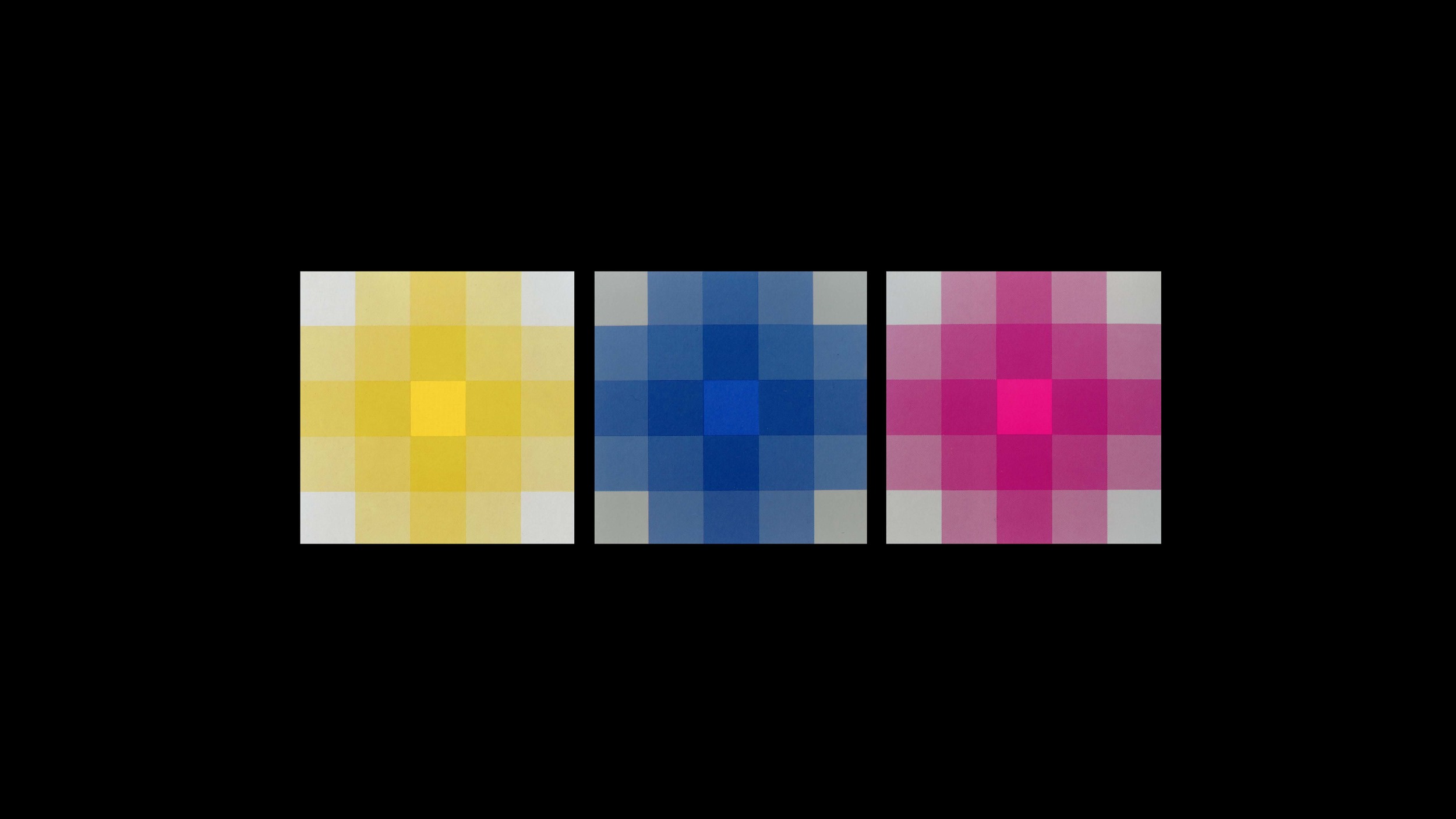
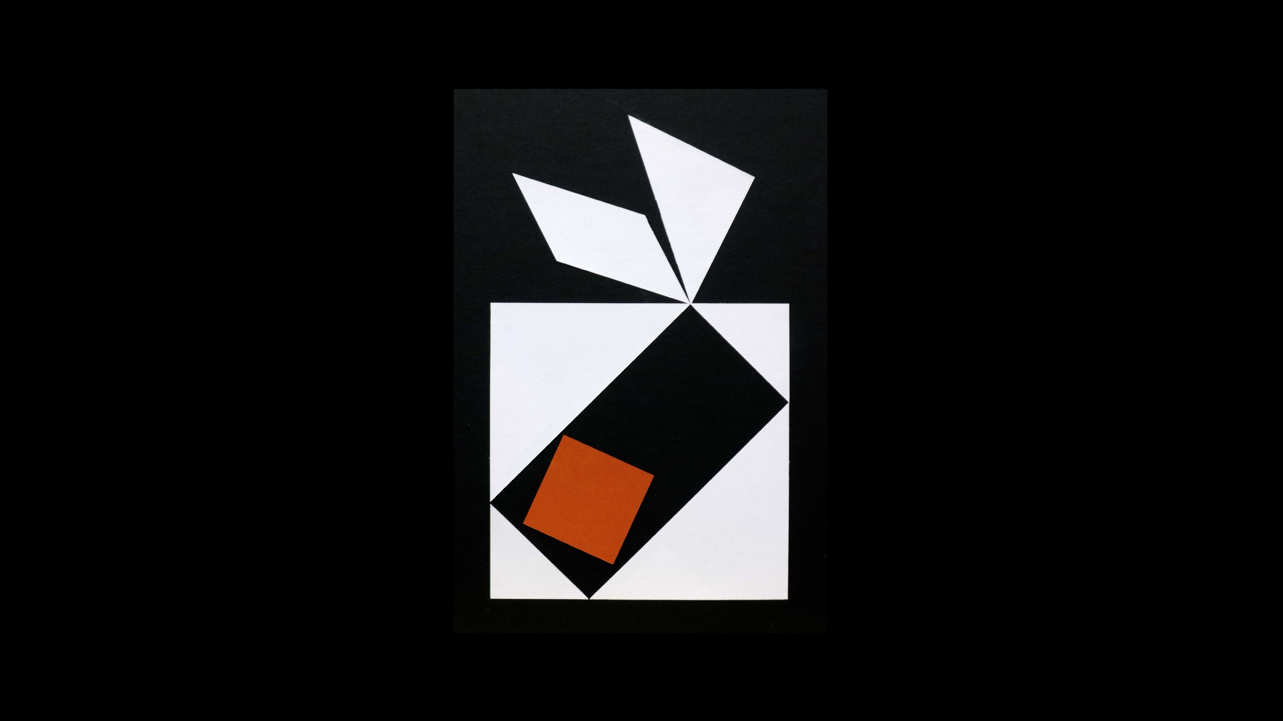
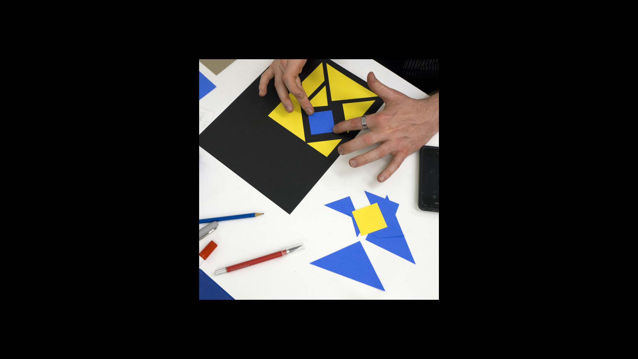
– make one color look like two 
– make two colors look alike
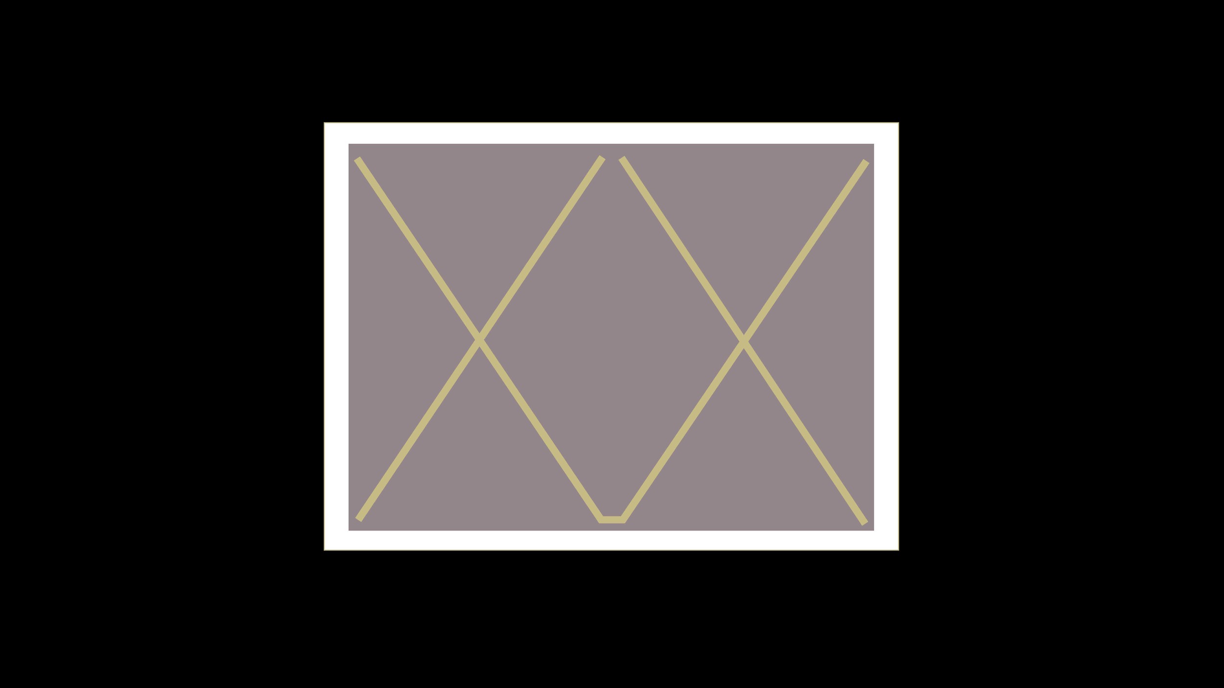
– make opaque colors appear transparent 

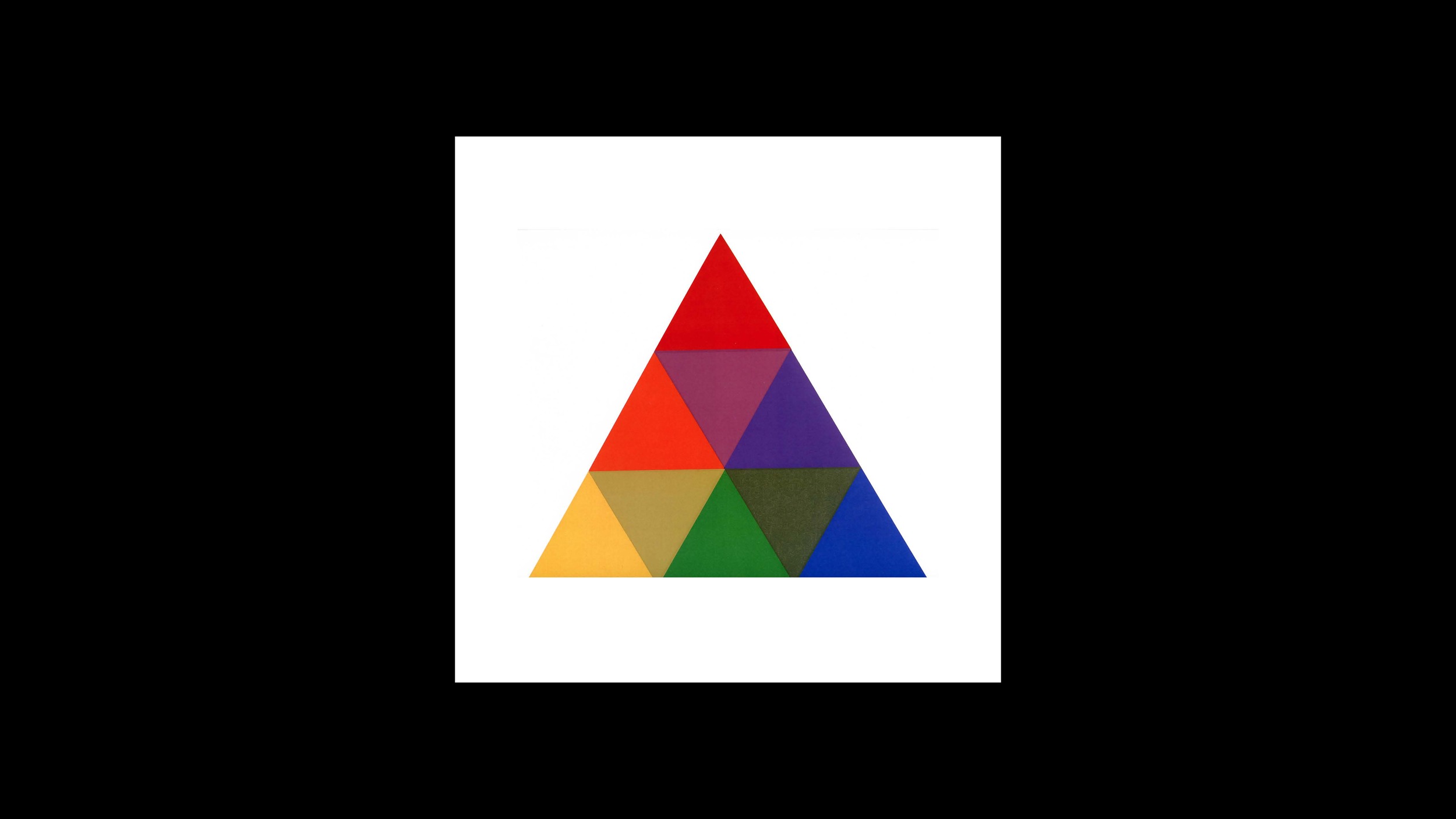
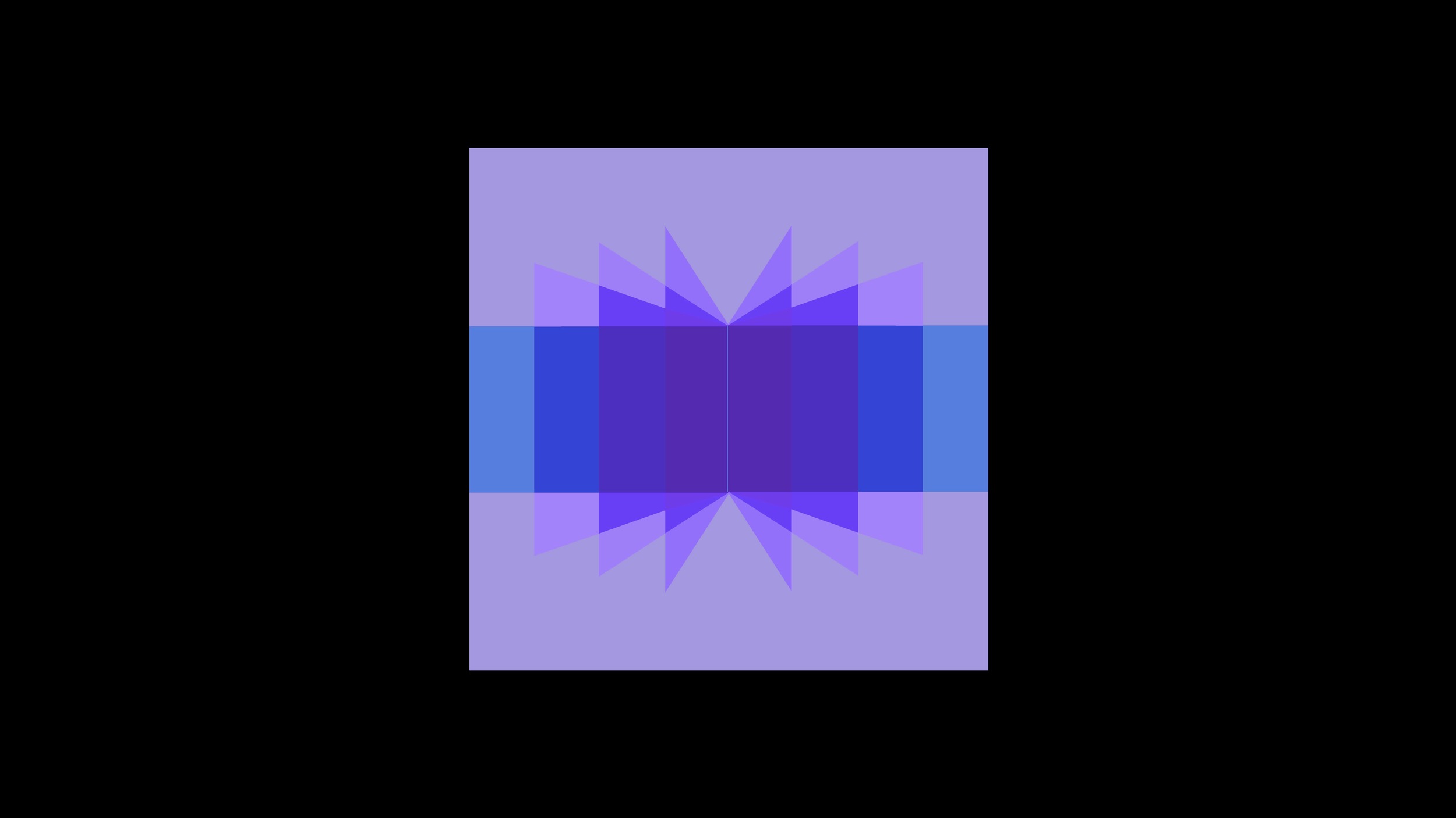
The goal of all the color illusion experiments was, and is, to make us hyperaware of "the relativity of color." 

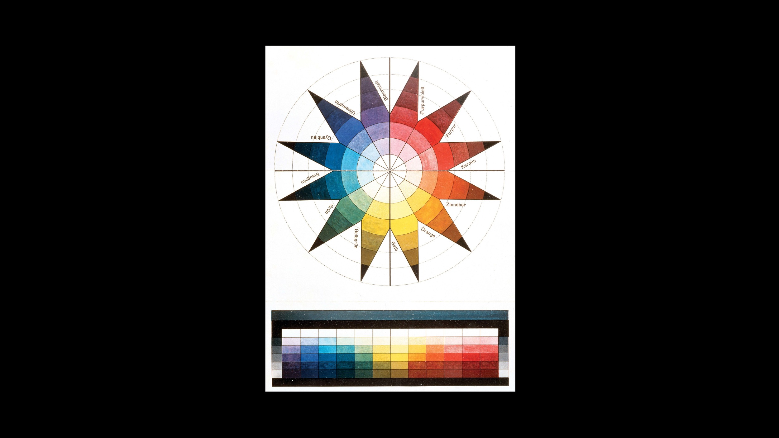
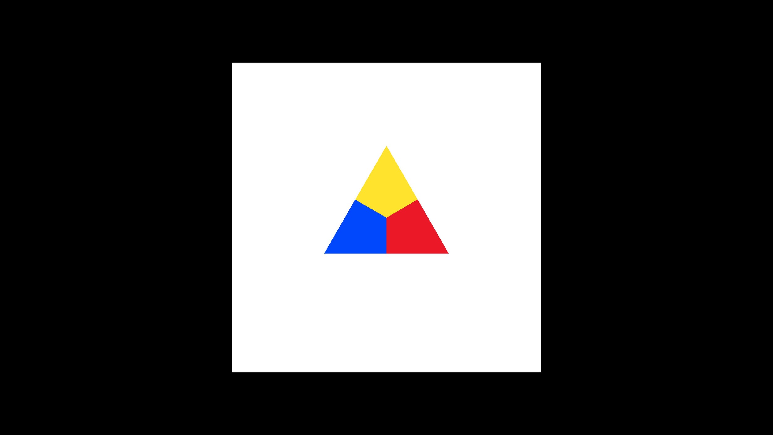
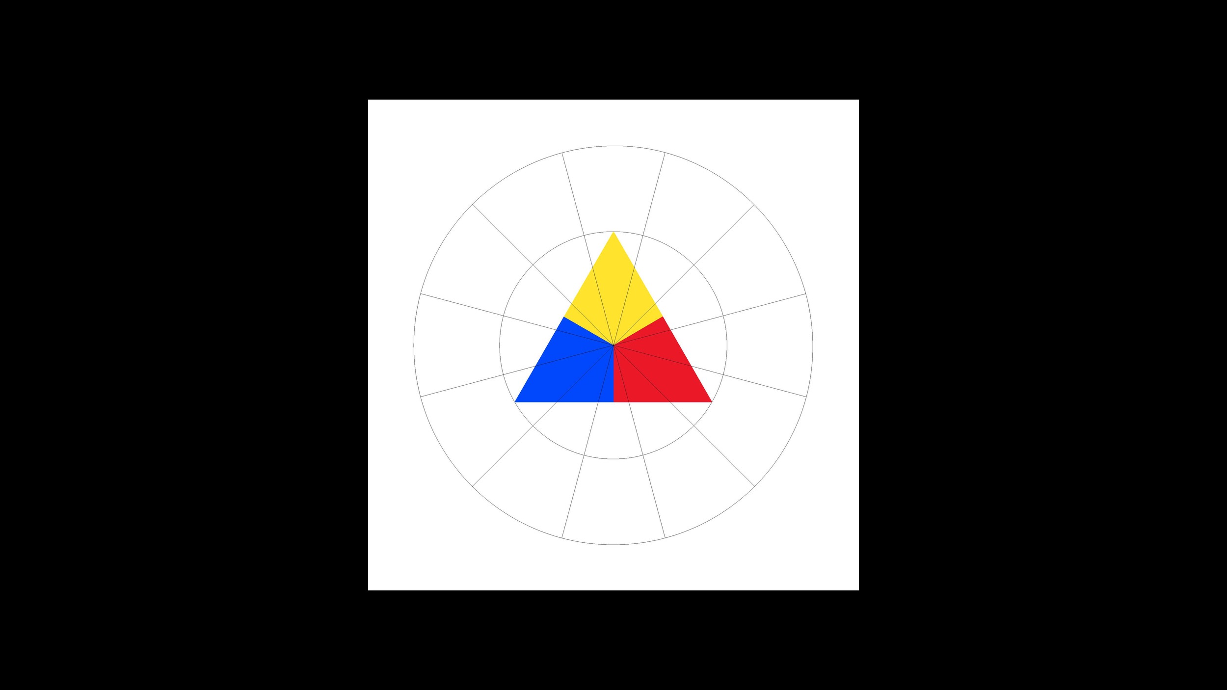
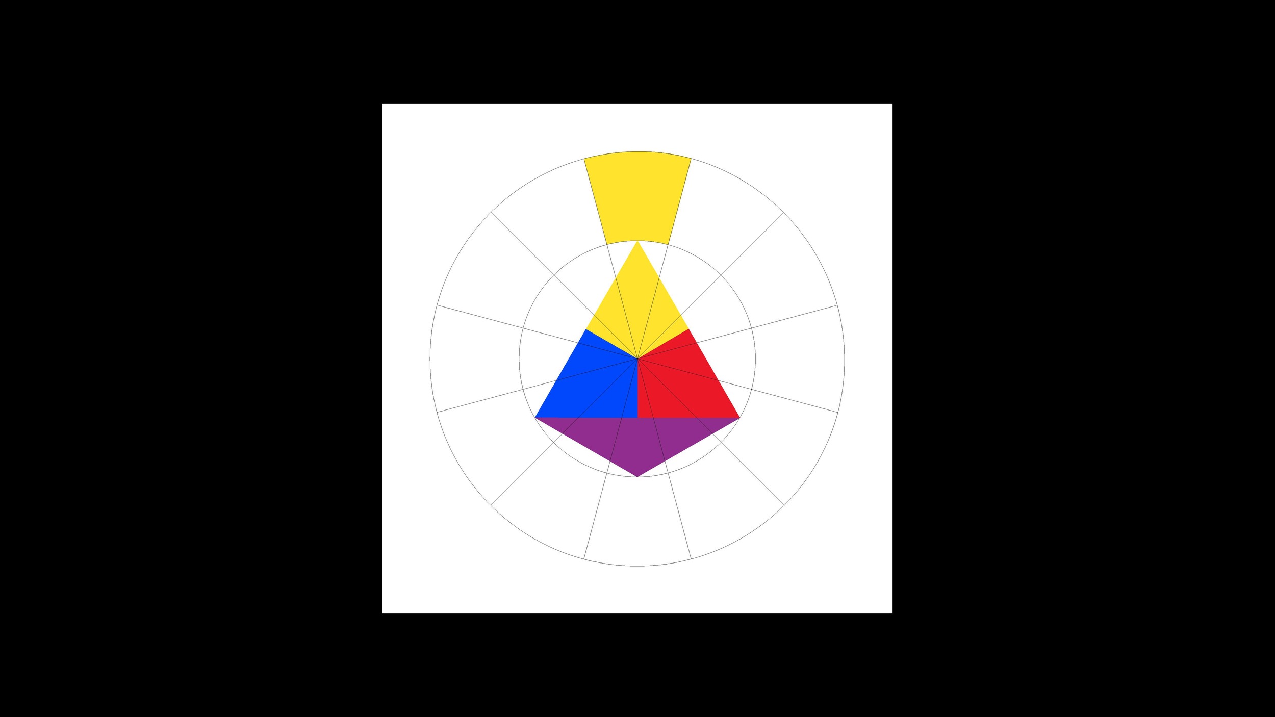
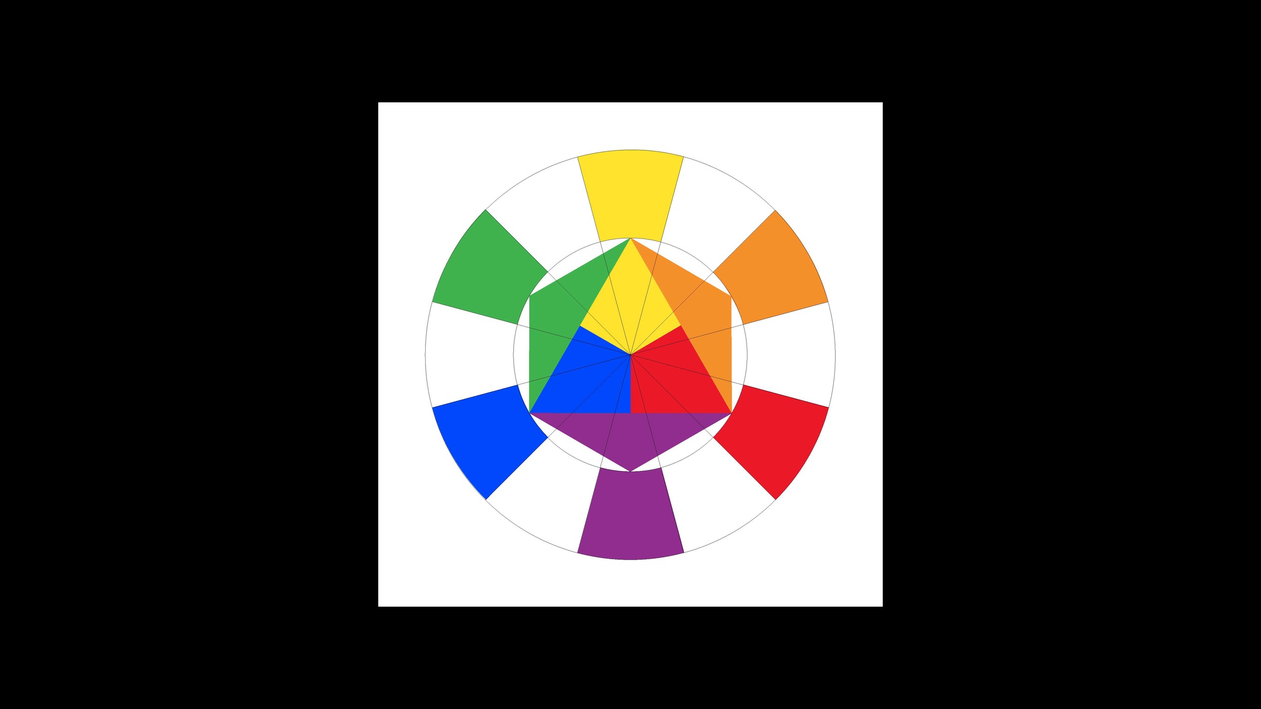
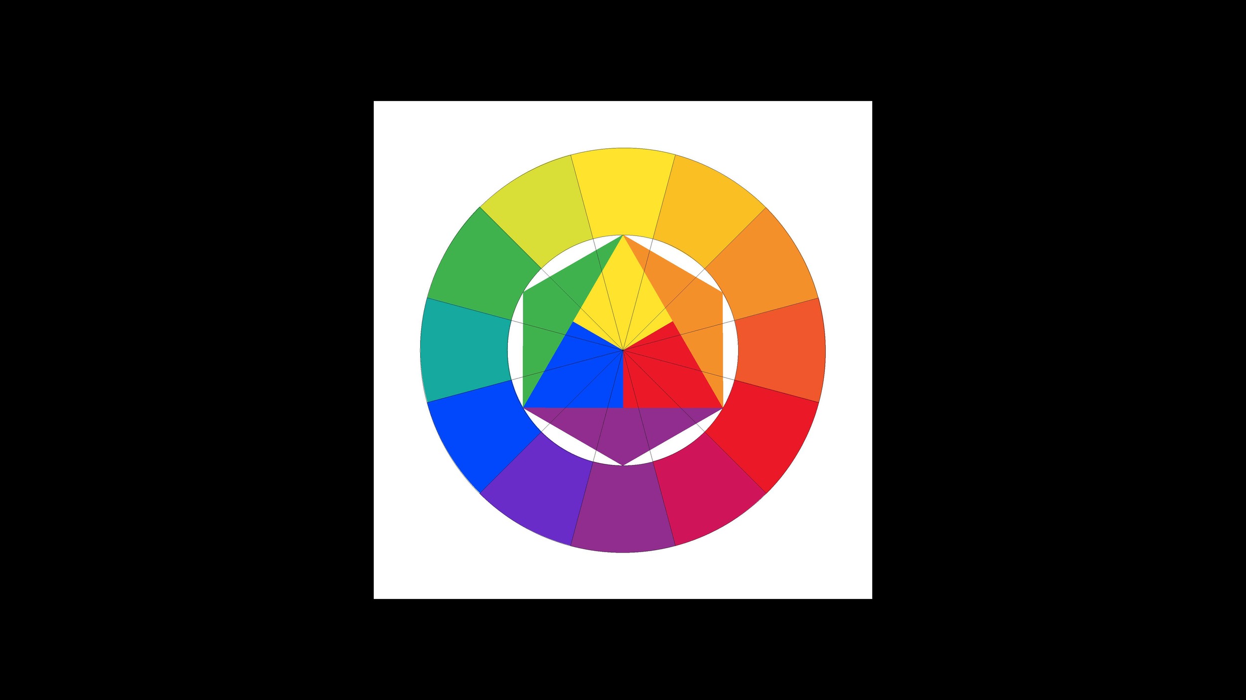
What is "the relativity of color"? Stated simply, the identity of a color depends on its situation: the light values and hue contrasts of the background and adjacent colors; the amounts, shapes, placements and boundaries of the colors. In Interaction of Color, Albers eloquently expresses this essential color theory principle: "a color has many faces," and "what counts is not the what but the how." 

Reading, viewing and studying Albers' Interaction of Color, and Johannes Itten's The Art of Color, is an empowering experience for anyone who desires a deeper awareness of art and design. I highly recommend seeking out these books, and if possible, adding them to your physical book collection. 

I confess, with great regret, that I gave away my original copy of Itten's The Elements of Color. At the time I didn't recognize its value—by the second year of art school I was committed to black and white photography, and beyond the principle of light/dark contrast, I didn't have much use for color theory. Now, I use my newer edition of The Elements of Color, along with The Art of Color and Interaction of Color, as primary sources of inspiration for all my color classes.

L1050923.jpg
L1050915.jpg
L1050918.jpg
L1050913.jpg
L1050968.jpg
L1050971.jpg
L1050941.jpg
L1050894.jpg

above
A color has many faces...
one color looks like two, two colors look like one. 
The background color "subtracts" itself from the color it surrounds,
causing the surrounded color to appear lighter or darker,
and sometimes changing the appearance of hue.

below
Opaque colors can appear to be transparent—an illusion of transparency.
The success of the illusion depends on finding a middle color
that convinces us of its authenticity, as the mixture of its parents. 
But these colors are not factual mixtures, like colors achieved by mixing paint.
Like their parents, these mixture colors are found, not made.

Albers asks us to "study color mixture in our imagination, that is, so to say, with closed eyes."

L1050892.jpg
L1050922.jpg
L1050944.jpg
L1050907.jpg
L1050958.jpg
L1050964.jpg
L1050961.jpg

color expression: war & peace

The color stripe composition, like a color grid, presents students with the challenge of exploring specific color contrasts. In this assignment, I asked students to explore what Itten called contrast of extension—also referred to as contrast of proportion. This form of color contrast is based on the concept of light values, originally proposed by the 19th century German polymath Johann Wolfgang von Goethe. 

Goethe devised a system of color harmony for primary and second colors, in which each color is assigned a numerical value based on its brilliance. Yellow, the color closest to white in brilliance, is assigned the highest light value; violet, the farthest from white in brillance, is the lowest. Red and green are equal in brillance, and equally distant from yellow and violet. Blue is closer in brillance to violet than green, and is assigned a value midway between those colors. Similarly, the brillance of orange is midway between yellow and red.

The numeral light values: yellow = 9, orange = 8, red = 6, violet = 3, blue = 4, green = 6.

In these projects, students used the principle of light values, along with personal color associations, to express concepts related to war and peace. They explored the idea of a stripe composition as a kind of abstract expression—the rhythmic intervals, proportional relationships, and suggestive characteristics of simple parallel forms. The visual structure of a diptych is employed to express the contrasts and connections of war and peace.


L1050822.jpg
L1050823.jpg
L1050831.jpg
L1050840.jpg
L1050848.jpg
L1050855.jpg
L1050865.jpg
L1050867.jpg
L1050874.jpg
L1050839.jpg

In this last example, the designer abandoned the traditional diptych structure and challenges our definition of stripes, to achieve a powerful expression of war and peace.

contrast of temperature

In these projects, students used the principle of color temperature contrast to create visual narratives that express ideas related to transformation, revelation, metamorphosis, mutation and distortion. Each set of compositions is like a storyboard—keyframes in an imaginary visual story.

Students explore the concept of warm and cool colors: how our sensory associations make complementary colors, like blue-green and red-orange, expressions of temperature change; how one hue can have warm and cool variants; how the principle of contrast of temperature is—like contrast of light/dark and complementary contrast—a powerful and effective tool for creating visual hierarchy.

Here, contrast of temperature also plays a roll in creating visual continuity. In each set, squares of warm and cool contrasting colors form connections between the individual compositions. These connections provide an abstract narrative structure.

L1050726.jpg
L1050744.jpg
L1050760.jpg
L1050775.jpg
L1050811.jpg
L1050742.jpg
L1050789.jpg
L1050800.jpg

complementary contrast

In these projects, students explore the relationships of complementary colors: red and green, yellow and violet, orange and blue. They use gouache to experiment with color mixing. They see firsthand the effects of mixing two complements—how the mixtures eventually reach a neutral color that has its own identity, but is harmonious with both parent colors. They also explore complementary colors found in common things—paint chips, paper and wood samples, processed food, things found in nature.

The color grid is an abstraction. It allows the student to focus on a specific principle of color theory—in this case, complementary contrast—and explore how it can be used to achieve dynamic compositions.

L1050643.jpg
L1050640.jpg
L1050615.jpg
L1050617.jpg
L1050626.jpg
L1050692.jpg
L1050681.jpg

color grids: expressions of opposites

I asked students in my Visual Language classes to create color grids that express emotions or sensations based on their memories, and then, create color grids that express the opposite emotions or sensations. Students used Color-aid, found paper, and gouache paint to create color squares. There were no limitations on colors. 

L1050487.jpg
L1050506.jpg
L1050475x.jpg
L1050597x.jpg
L1050508x.jpg
L1050589x.jpg